Contact Us

Use the form on the right to contact us.

You can edit the text in this area, and change where the contact form on the right submits to, by entering edit mode using the modes on the bottom right. 


123 Street Avenue, City Town, 99999

(123) 555-6789

email@address.com


You can set your address, phone number, email and site description in the settings tab.
Link to read me page with more information.

GOODS WE LIKE

GOODS WE LIKE

Filtering by Tag: interior

MOEBE – Honest and Intuitive Design

Alex Rückheim

MOEBE Danish Design Studio

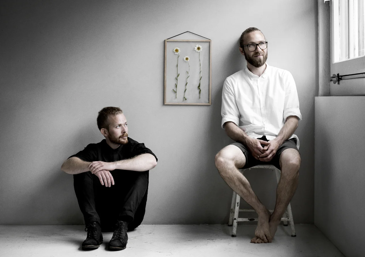
MOEBE is a Scandinavian design studio based in Copenhagen, Denmark, and consists of cabinetmaker Anders Thams and architects Nicholas Oldroyd and Martin D. Christensen.

The beauty about MOEBE is that the studio deliberately keeps things simple, without sacrificing its quality, curiosity, honesty and level of consideration. With a clear focus on the essentials, the brand strives to reduce its designs to their most simple forms, thereby creating intuitive, honest and long-lasting products.

Founded by Anders and Martin over a cup of coffee back in 2014, the name MOEBE derives from ‘Amoeba’ – the single-celled organism, representing the simplicity in their design DNA – and the word ‘Møbel' (furniture), which hints at the type of products the studio designs.
 

“We keep things simple. The world is complex enough.”


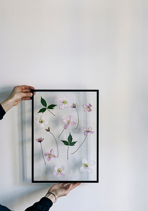
Possibly the most iconic design of the studio – and a personal favourite – is its transparent frames. A re-interpretation of the classic clip-on picture frame, the idea was to reduce it to its core form and make it simpler in its construction and expression while retaining the flexibility of conventional clip-on frames. It consists of two panes of acrylic glass, a frame comprised of four detachable panels of either oak or aluminium (black and white), and a rubber band. The rubber band both holds the frame together and serves for hanging the frame on your wall. The frame is available in A2, A3, A4 and A5 format.

One of the studio’s most recent launches is its beautiful Wall Mirror, a frameless mirror held by a lightweight wire form. In staying true to its core design principles, it is designed by stripping the mirror down to its essential elements. Available in either powder coated black, white or solid brass.
Boskke – Urban Gardening Design

Alex Rückheim

Boskke
Boskke
Boskke

With two-thirds of the global population expected to live in urban cities by 2050, people are increasingly looking for ways to reconnect with nature. After all, 82% of people in the UK say being surrounded by greenery makes them feel happier. But with life moving faster than ever, time and also space are increasingly limited. Boskke (meaning ‘little forest’ in old English) therefore set out with the mission to find new ways to gardening that appreciate the challenges of city living and to encourage greenery in our cities, homes and workplaces. “Boskke is derived from the old English word ‘bosky’ which means ‘a small forest’,” says Boskke cofounder Patrick. “And that’s exactly what you can create with our intelligent, eco-sensitive designs.”

Boskke is a London-based urban gardening product design firm that is not only one of the pioneers of ceiling gardening, but the studio has been developing urban gardening products since 2009. Co-founded by Patrick and Jake Morris, the two brothers hail from Matakana, New Zealand, where their family runs Morris & James, the country’s leading producer of hand-made ceramic pots and homewares. “Our parents have been making garden pots since 1977, so we grew up with ceramics,” says Jake. “Boskke is a continuation of our family heritage, but with a contemporary angle.”

The brand’s signature piece is the Sky Planter that Patrick designed in the final year of his degree in ceramic design at Central Saint Martins – the design won him the New Designer 2008 Award and the Red Dot Award in 2011.

In February, Boskke launched Flipped – a new planter that is both playful and deliberate in its design. Inspired by the way traditional plant pots are often stacked upside down when they’re not in use, the outer body works as a water reservoir, supplying moisture to the plant for up to two weeks using Slo-Flo irrigation technology.

STEPHEN & LEO CHI - Chi and Chi Studio, Taiwan

Alex Rückheim

Chi and Chi Studio, Taiwan
Chi and Chi Studio, Polygon Watch, Taiwan
Chi and Chi Studio, Memo Bank, Taiwan
chi and chi design watch
Chi and Chi Studio, Taiwan
Chi and Chi Studio, Taiwan design

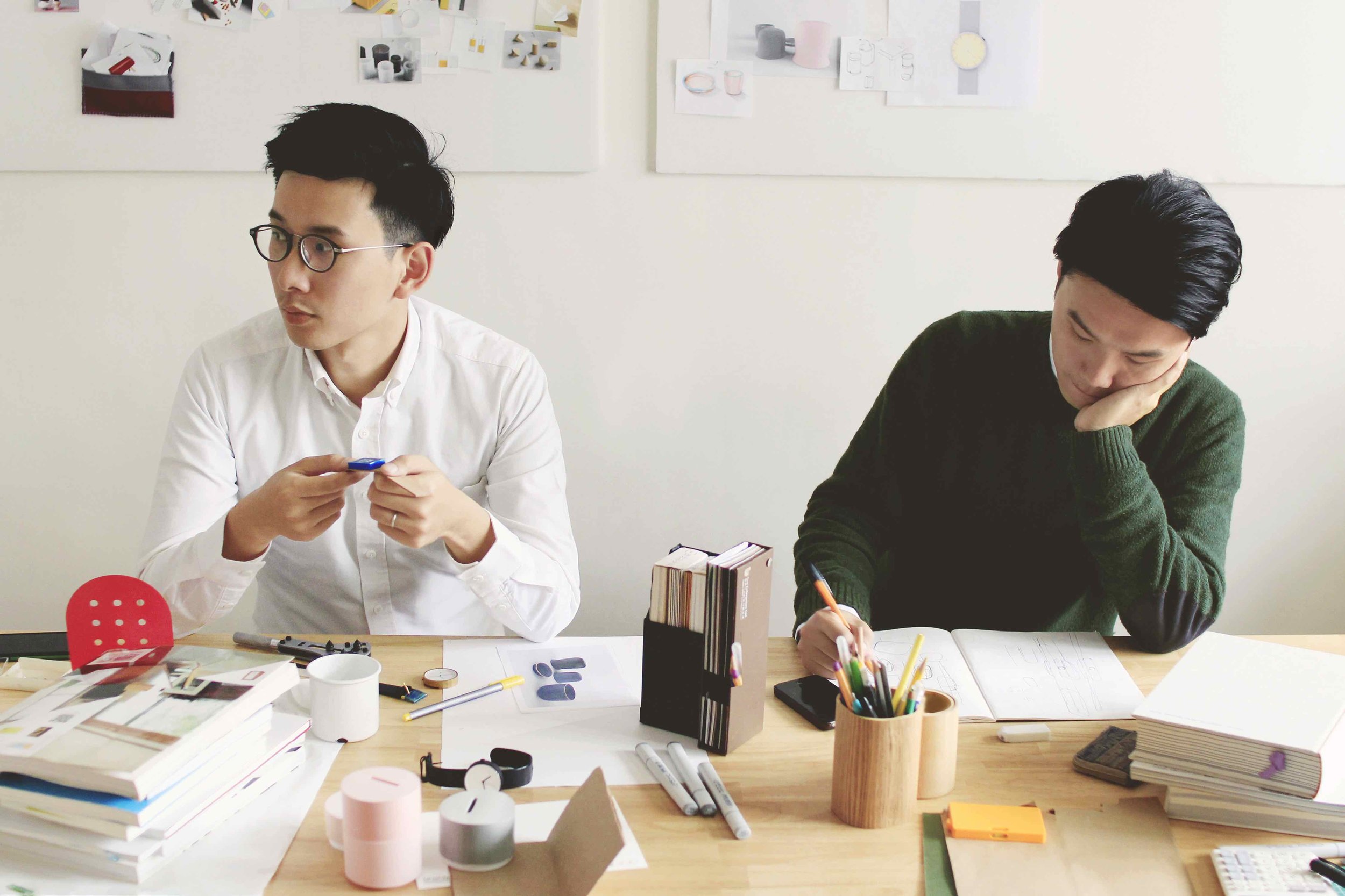
Chi and Chi is a Taiwanese design studio that was founded by brothers Stephen Chiu Chi Hung and Leo Chiu Chi Tat in 2013. Formerly full-time designers for other studios, the two Hong Kongese brothers decided to set up their own studio, driven by a desire to develop a better understanding of products’ lives and to work more closely with manufacturers. “The meaning behind an object should come first – its story, its interesting facts and its uniqueness,” says Stephen.

The duo pays close attention to the relationship between people and objects. Taking inspiration from everyday – often forgotten or ‘normalised’ – objects, Chi and Chi aim to create and redesign objects with content and purpose; with simple functions in their essential forms; that look nice, work well and make someone’s day happier.

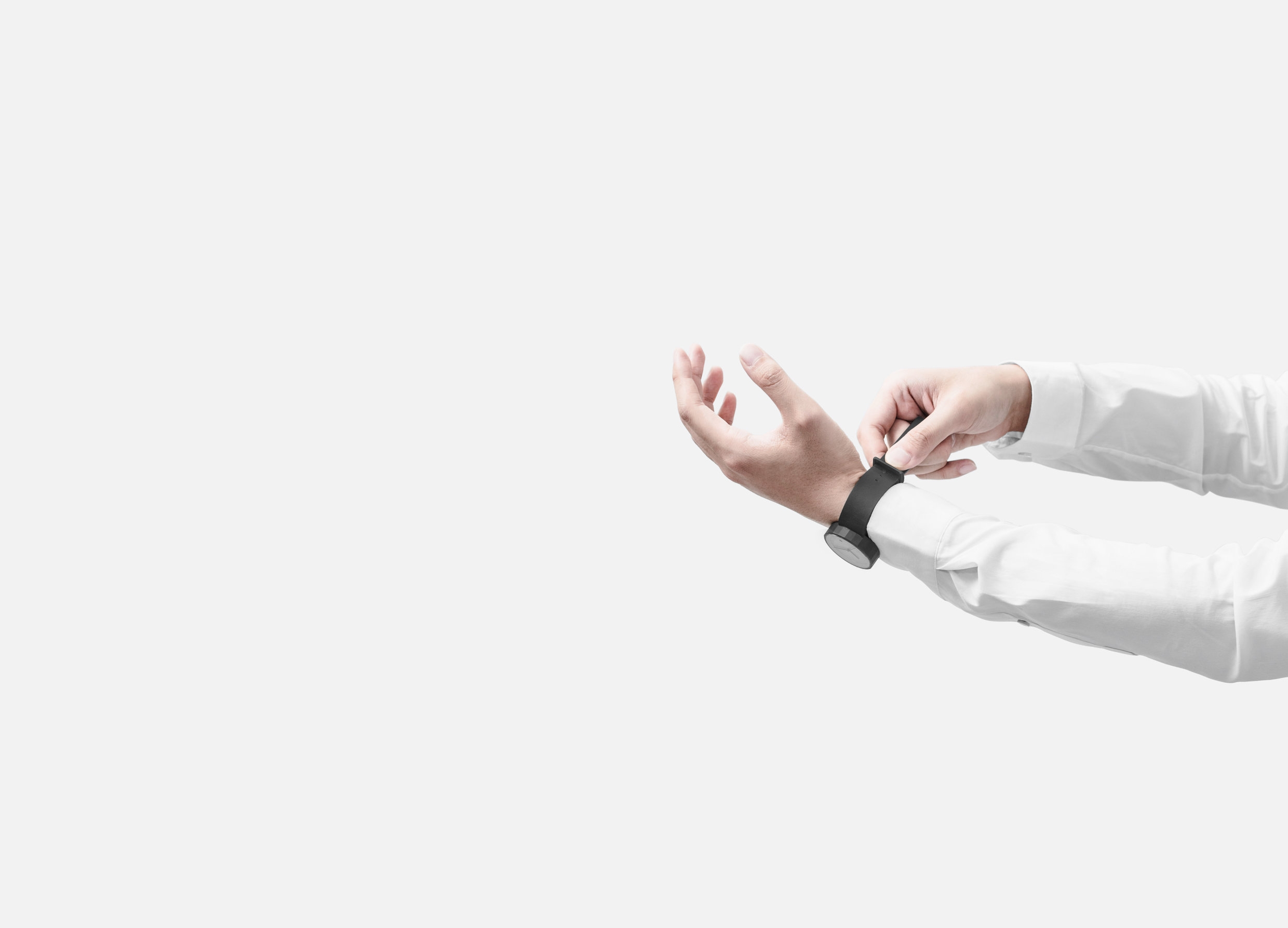
The Polygon watch – the studio’s signature piece – is a modern 24-sided analogue timepiece. Each side of its unusual faceted case corresponds to an hour of the day. The watch is designed with geometric features and made with precision engineering and careful hand polishing. Unlike the usual round and smoothened contours of regular watches, Chi and Chi’s Polygon watch preserves the ‘edges’, thereby presenting the time in a distinctively different yet aesthetic way.

For Chi and Chi, working closely with its manufacturers is an integral part of the creative process, and the studio had initially struggled to find a watchmaker able to produce the Polygon’s geometric silhouette. “At the beginning, several manufacturers turned us down because it was too difficult to make,” explains Stephen. “We almost needed to redesign the whole watch.” Instead, the studio has now successfully launched its second edition of the Polygon series.


“The reason we set up the studio is to have a better understanding on product life, not merely to design an object. We can work closely with manufacturers, create something cool with clients and have more interaction with the customers.”
 

Meanwhile, Chi and Chi is partnering with brands and creatives on designing new products set to launch in early 2017, including tableware and home accessories. Make sure to scroll down the page to view a personal selection of the brothers' favourite works of art, artists and products as well as the things that inspire them.
 

@chiandchico 

chiandchi.com


The composition of images below is a personal selection of Stephen and Leo Chi's Favourite Works of Art, Favourite Products and the things that inspire them.


by Clay Mahn

by Clay Mahn

Arne Jacobsen, Tongue Chair

Arne Jacobsen, Tongue Chair

Harry Bertoia, Silver Teapot, 1940

Harry Bertoia, Silver Teapot, 1940

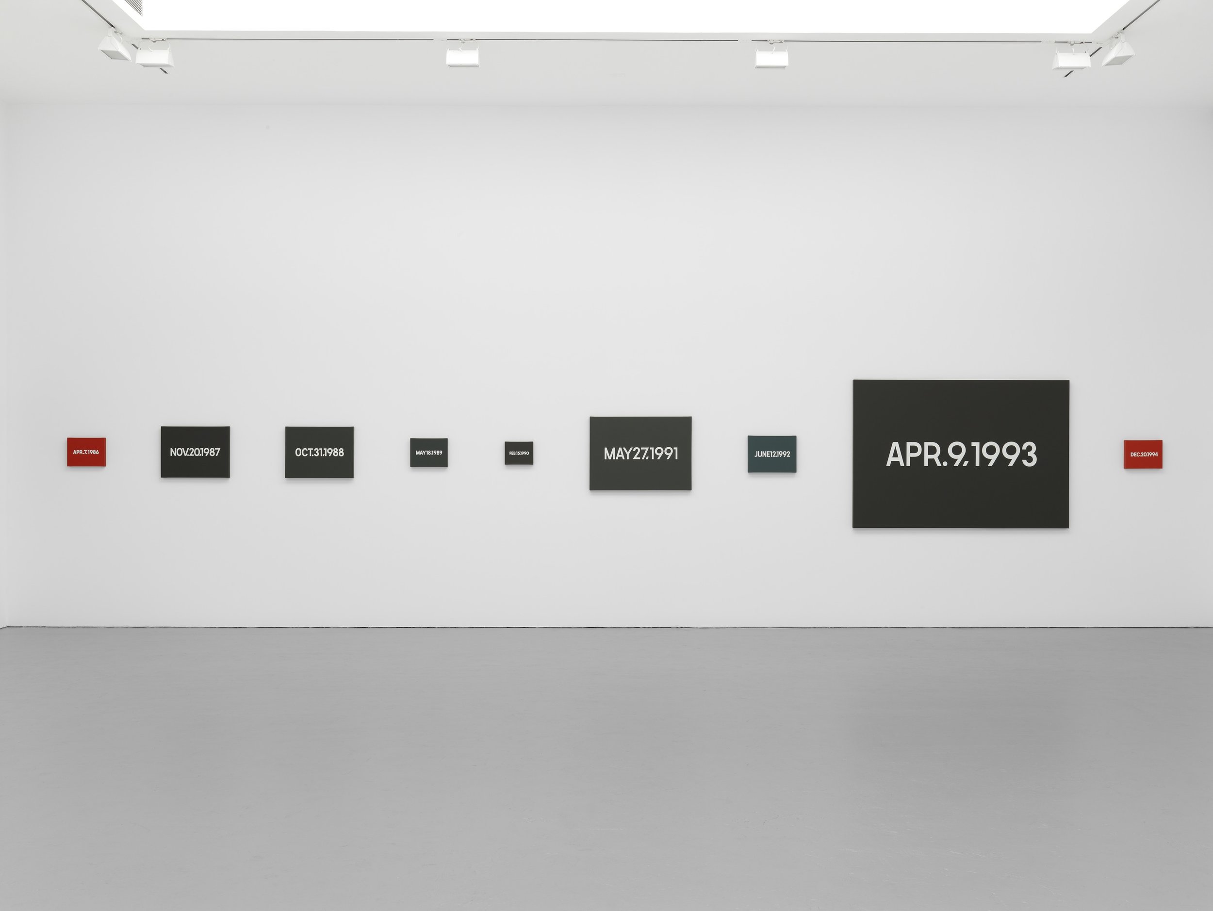
On Kawara, Date Painting(s)

On Kawara, Date Painting(s)

Lucie Rie, Conical Porcelain Bowl

Lucie Rie, Conical Porcelain Bowl

Floris Hovers, CARtools

Floris Hovers, CARtools

Sabine Finkenauer, Sculpture-sample, 2010

Sabine Finkenauer, Sculpture-sample, 2010

Designed by Dieter Rams 

Designed by Dieter Rams 

Paul Winstanley, Art School 16, 2013

Paul Winstanley, Art School 16, 2013

Harry Gitlin,Table Lamp, Model T9, 1951

Harry Gitlin,Table Lamp, Model T9, 1951

Marcel Breuer, Cesca Side Chair (model B32), 1928

Marcel Breuer, Cesca Side Chair (model B32), 1928

Josef Alvers, Never Before a, 1976

Josef Alvers, Never Before a, 1976

Bruno Mathsso, MI 1050 Wall Unit

Bruno Mathsso, MI 1050 Wall Unit

Daniel Steegmann Mangrané, Cripsis, 2013

Daniel Steegmann Mangrané, Cripsis, 2013

Tadao Ando - Architect

Tadao Ando - Architect

Designed by Naoto Fukasawa 

Designed by Naoto Fukasawa 

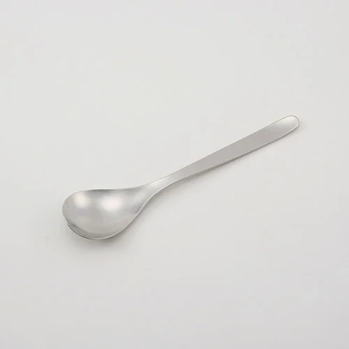
Sori Yanagi, Spoon

Sori Yanagi, Spoon

Izziyana Suhaimi, Reaching for equilibirum

Izziyana Suhaimi, Reaching for equilibirum

Molded Pentray by collaboration brand "PH" (HIGHTIDE and PAPIER LABO)

Molded Pentray by collaboration brand "PH" (HIGHTIDE and PAPIER LABO)

Kaj-Franck, Kilta

Kaj-Franck, Kilta

Walter De Maria, Tryth / Beauty Series

Walter De Maria, Tryth / Beauty Series

Vitsœ - The Power of Good Design | FREE Copy

Alex Rückheim

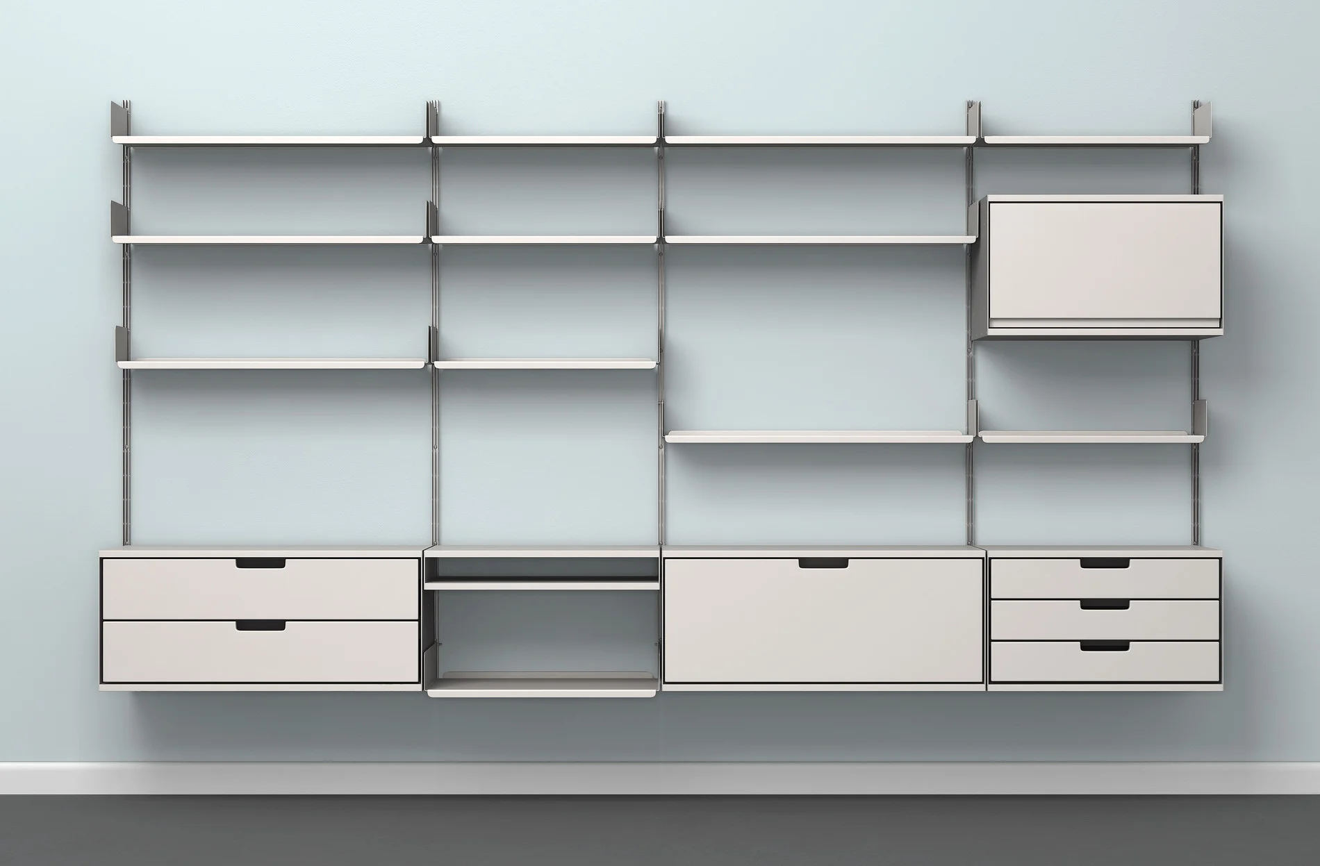
Vitsœ currently offers three products designed by Dieter Rams: the 606 Universal Shelving System, the 620 Chair Programme and the 621 Table.

To celebrate the design principles coined by Dieter Rams, Vitsœ have published a pocket-sized compendium detailing these very principles – the ethos that underlies each and every step of the company.

Vitsœ and GOODS WE LIKE have teamed up with the aim to spread this design ethos as far as possible, making the publication accessible to everyone.

Note: the send-out of the free copies has now ended. If you wish to request a copy, please get in touch directly with Vitsœ.

--

Founded in 1959 with the aim to allow more people to live better with less that lasts longer, renowned furniture company Vitsœ has consistently stood up to a world that appears to value only things that are new. For this reason, the London-based brand set out with the mission to make long-living furniture; always seeking to be better rather than newer. 


Live better with less that lasts longer.


The beauty about Vitsœ is that the company designs, makes and evolves furniture that lasts for generations. Based on this principle, Niels Vitsœ and Otto Zapf decided to establish a company to realise the furniture designs of Dieter Rams – known for his unobtrusive approach and belief in “less but better”. As one of the foremost industrial designers of the 20th century, the former Braun designer has not only shaped the Functionalist school of industrial design, but his design principles have been – and still are – an inspiration to a whole generation of designers.

Becoming increasingly concerned by the state of the world around him, Rams asked himself probably one of the most important questions in his career: is my design good design? As good design can’t be expressed in finite terms, he set about expressing the ten most important principles for what he considered was good design. This chain of thought resulted in what is known as The Ten Principles for Good Design.

STACK - Inkjet Printer by Mugi Yamamoto

Alex Rückheim

stack_design_prize_switzerland_ecal

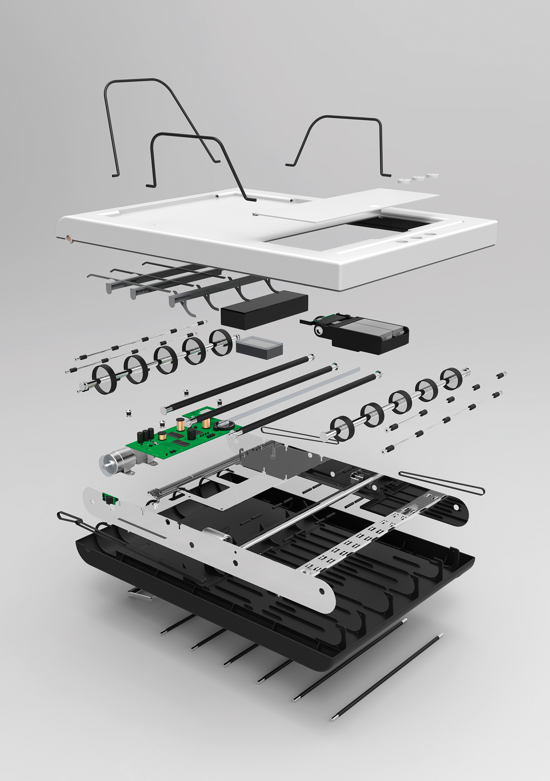
Stack – a truly innovative inkjet printer designed by product designer and ECAL alumnus Mugi Yamamoto. The printer is reduced down to the central function of a device of this sort – the actual printing. With traditional printers, the largest component is the paper compartment. Stack does without it altogether. 

The printer is placed directly on the stack of paper that is to be printed. During printing, the individual sheets are pulled in from below and ejected again at the top of the device. Stack thus works its way, so to speak, through the pile of paper until the paper runs out. As a result of this approach, the printer has a highly compact, simple and appealing design. 

Essential conditions for the creation of the device were a careful choice of components and the development of a special infeed mechanism. Stack is designed to meet the needs of people who work in a mobile manner or in a confined space, and have problems with the bulky form of ordinary printers.

Stack has been awarded with the Design Prize Switzerland 2016 in the category 'Rado Star Prize Switzerland for Young Talents'.

LIQUID SPACES – Installations and Spatial Experiences

Alex Rückheim

Liquid Spaces - gestalten

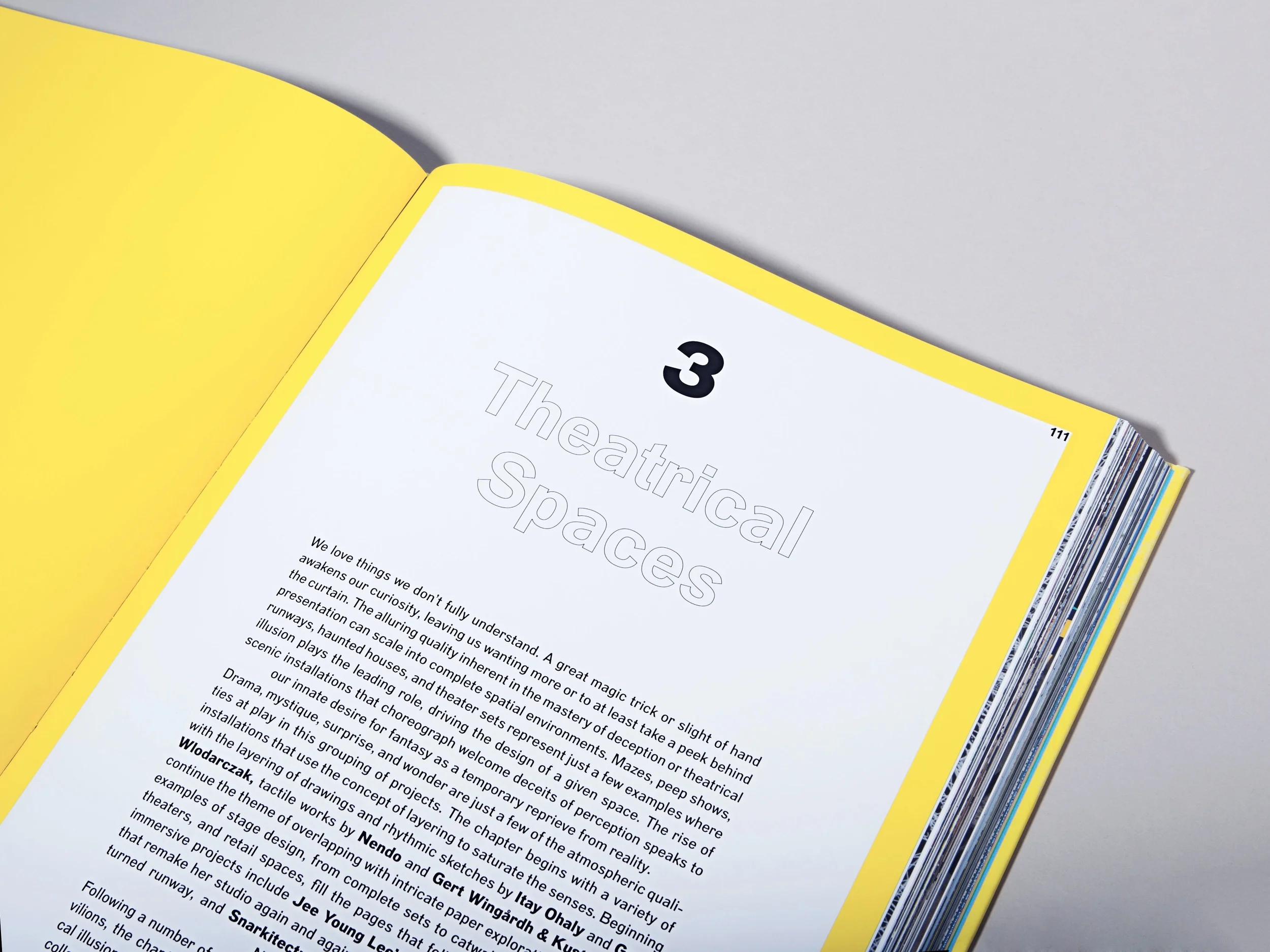
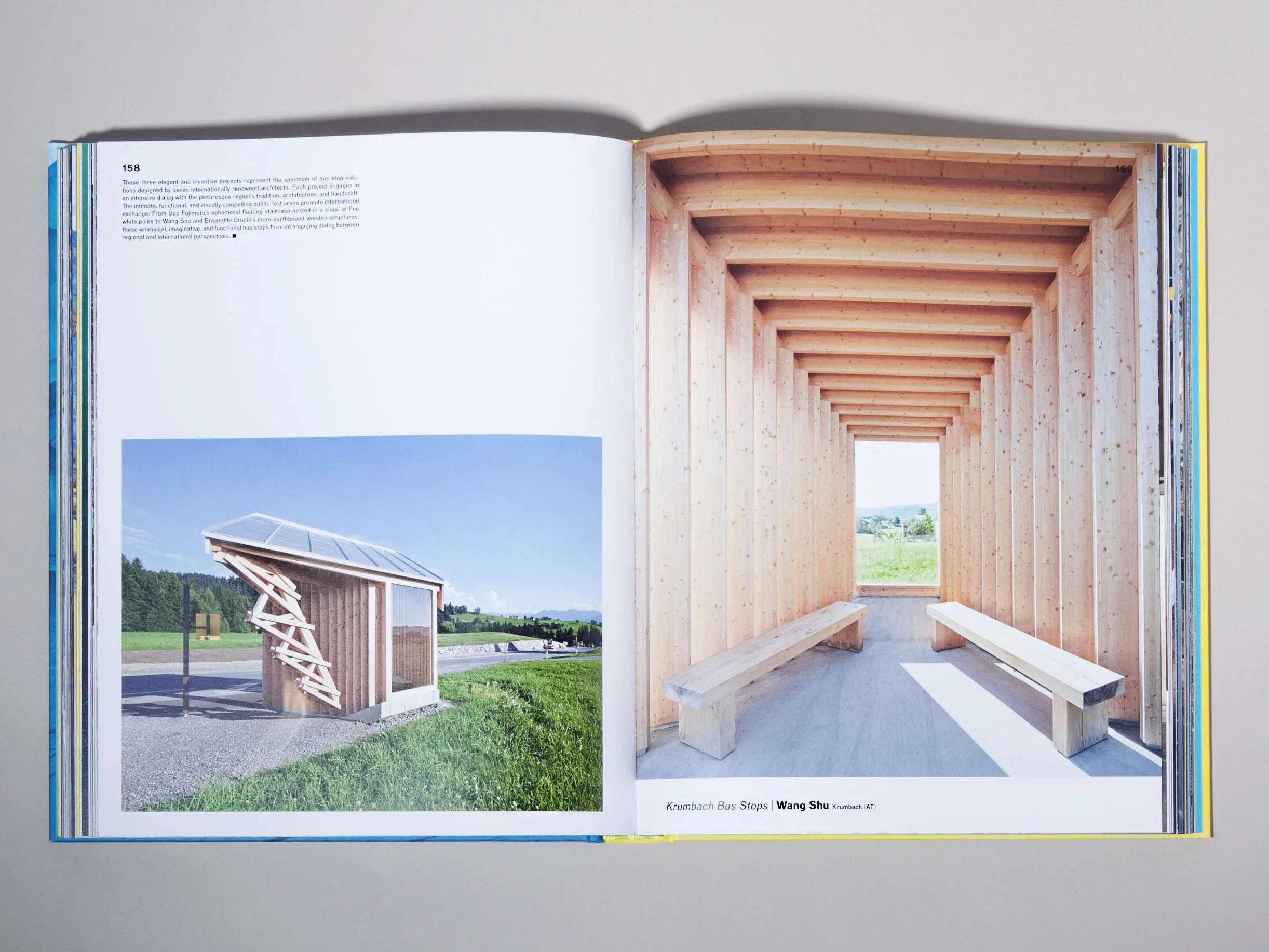
Liquid Spaces is one or favourite books among Gestalten’s publications for this season. Edited by Sofia Borges, Sven Ehmann and Robert Klanten, Liquid Spaces explores the impact of spatial and tangible experiences on human perception and the notion of lasting, sensual encounters. 

This discourse is becoming increasingly important as – in today’s hyper digitalised age – unforgettable experiences lay the foundation of a meaningful dialogue and relationship between artist and audience, museum and visitor or brand and consumer. 


“Surprising materials, colors, shapes, and surfaces provide the props, which alongside innovative smells, sounds, and lighting concepts come together in expansive, stage-like gestures with sculptural details.” 


Divided into four different sections – Geometric Spaces, Ephemeral Spaces, Theatrical Spaces and Immersive Spaces – the book intriguingly showcases the many different ways in which galleries, museums, temporary events, pop-up shops and flagships stores playfully experiment with the idea of crafting an impactful spatial experience. This said, diving into its 256 pages, you’ll find a wide spectrum of unconventional environments and extraordinary spaces created by artists, scenographers, and architects as well as both interior and exhibition designers.

Photographed by Ali Baïlon for GOODS WE LIKE

FREDERIK ROIJÉ – Guidelines Magazine Rack

Alex Rückheim

FREDERIK ROIJÉ – Guidelines Magazine Rack

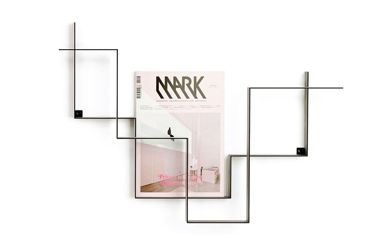
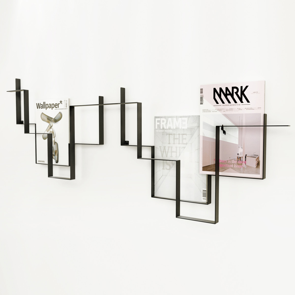
Simply beautiful. Made from a powder-coated steel framework, ‘Guidelines’ is a beautifully designed magazine rack by Frederik Roijé. A nice-to- have interior design piece for any magazine lover, Guidelines allows you to display up to nine of your favourite magazines and covers in the most artful way.

Known for their creative and innovative approach to product and spatial design, Frederik Roijé specialises in furniture, lighting, interior and industrial design.

STELTON x SOMETHING DESIGN – Collar Coffee Set

Alex Rückheim

Collar Stelton Coffee Set

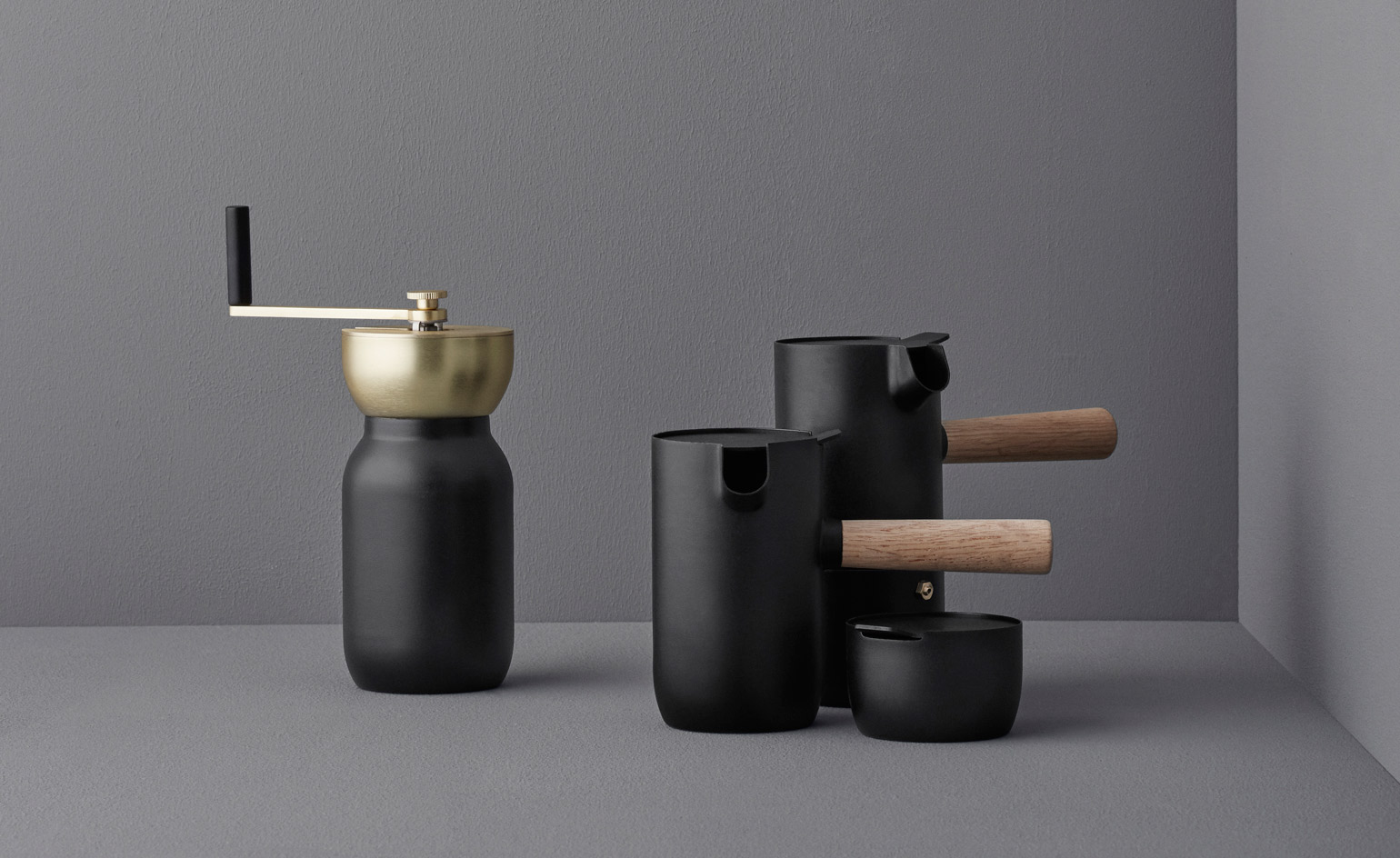
‘Collar’ is a new brewing collection designed by Italian studio Something Design for Danish brand Stelton

Apparently, the objective was clear: to inject enjoyment into the ritual of coffee brewing. Although practical and functional in its purest sense, the collection – which consists of a coffee grinder, jar, milk jug and sugar bowl – does by no means lack design thinking and aesthetic consciousness. 

Inspired by both Scandinavian design and ‘cultural observations’, Collar will sit perfectly in any coffee and design lover’s home. Available from September.

AANDERSSON – Olov Bowl

Alex Rückheim

AANDERSSON Olov Bowl

Philadelphia based design concept AANDERSSON specialises in experimental approaches to ceramic design. Founded by Ian Anderson, the studio’s collections are generally defined by an intriguing interplay between the juxtaposition of both familiar and fundamental design elements and highly considered functional forms.

AANDERSSON’s Olov bowl is part of the deconstructions collection, which explores the impact of radical alteration on the ultimate functionality of traditional utilitarian forms. All pieces in the collection remain functional. Material: premium quality porcelain.