Contact Us

Use the form on the right to contact us.

You can edit the text in this area, and change where the contact form on the right submits to, by entering edit mode using the modes on the bottom right. 


123 Street Avenue, City Town, 99999

(123) 555-6789

email@address.com


You can set your address, phone number, email and site description in the settings tab.
Link to read me page with more information.

GOODS WE LIKE

GOODS WE LIKE

Filtering by Tag: design

ASKET - The Sweatshirt

Alex Rückheim

ASKET - The Sweatshirt

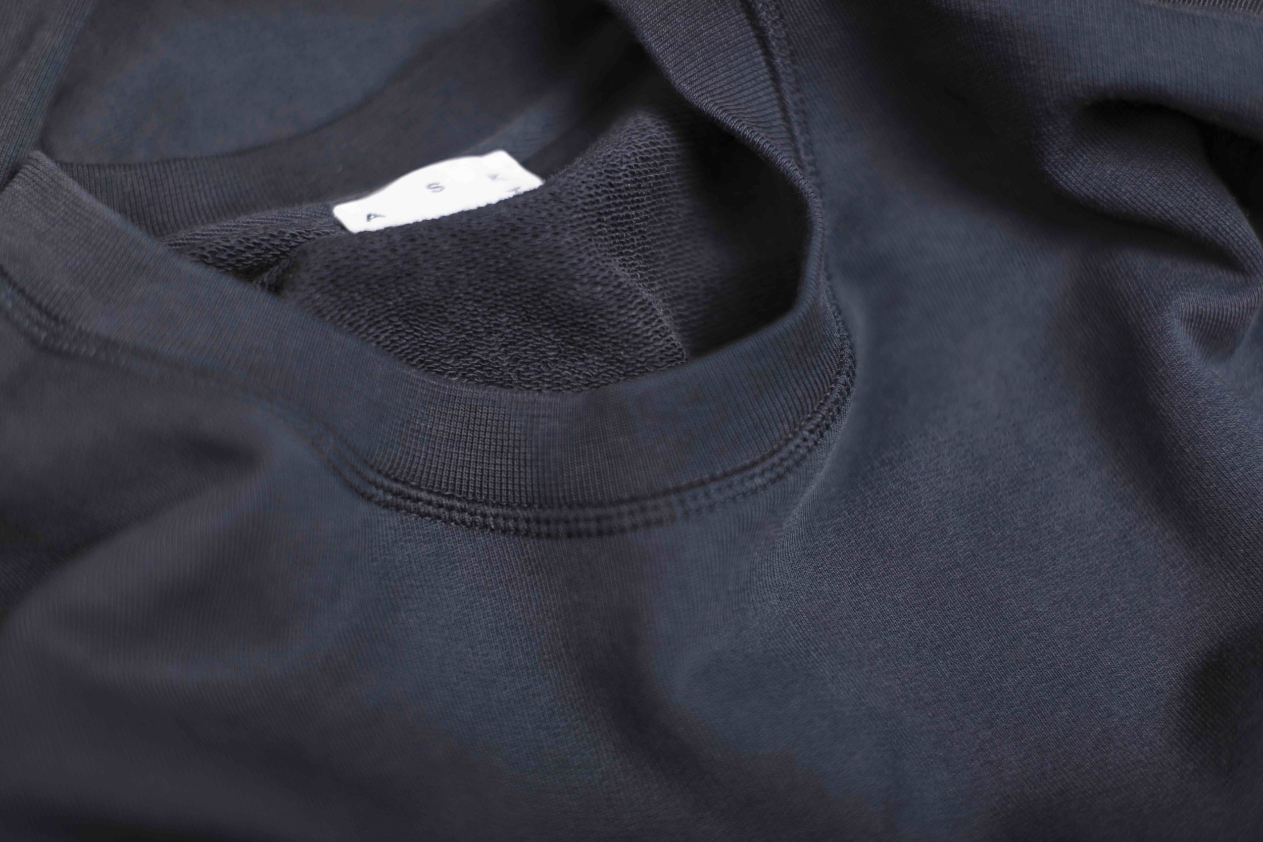
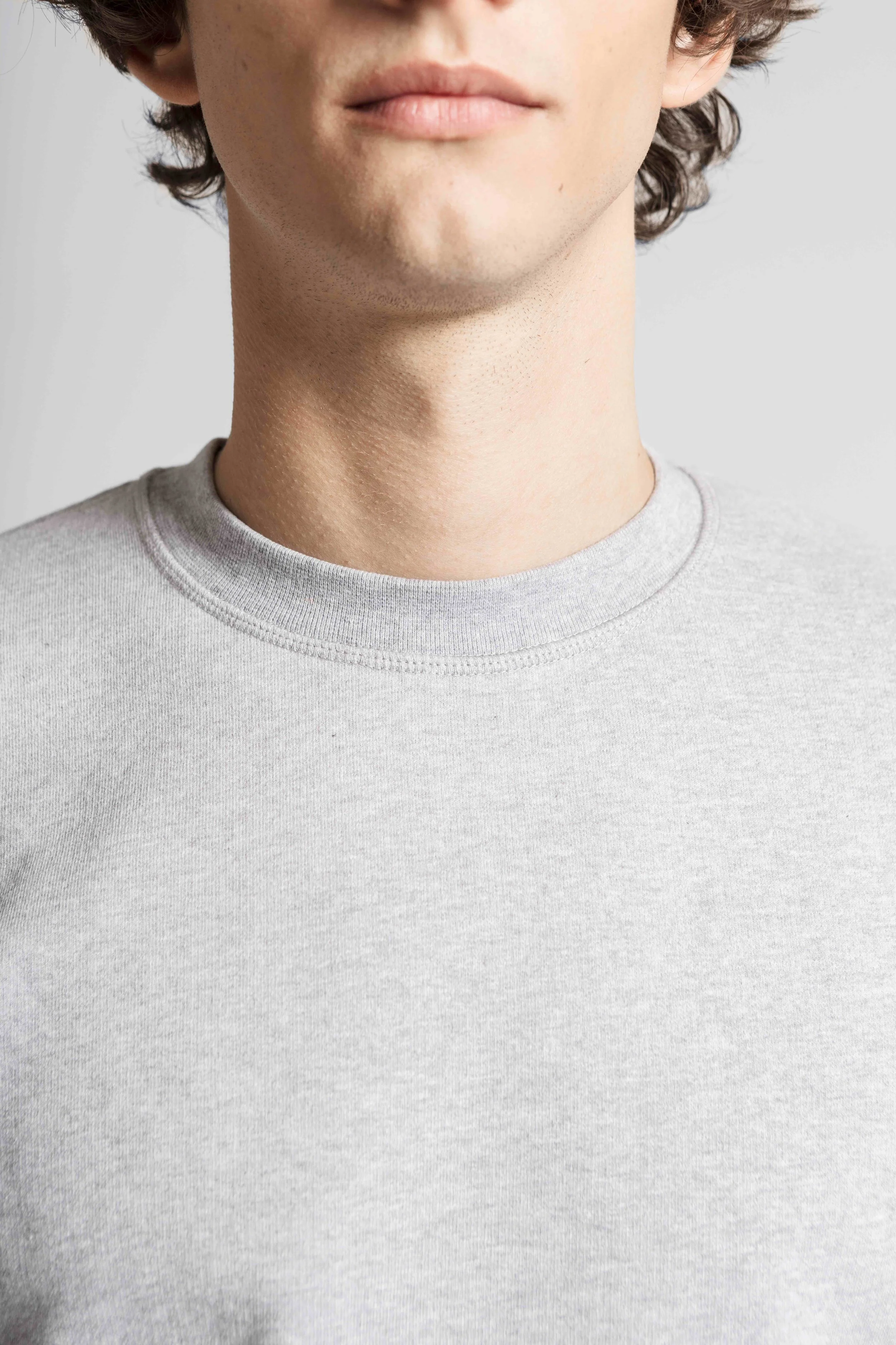
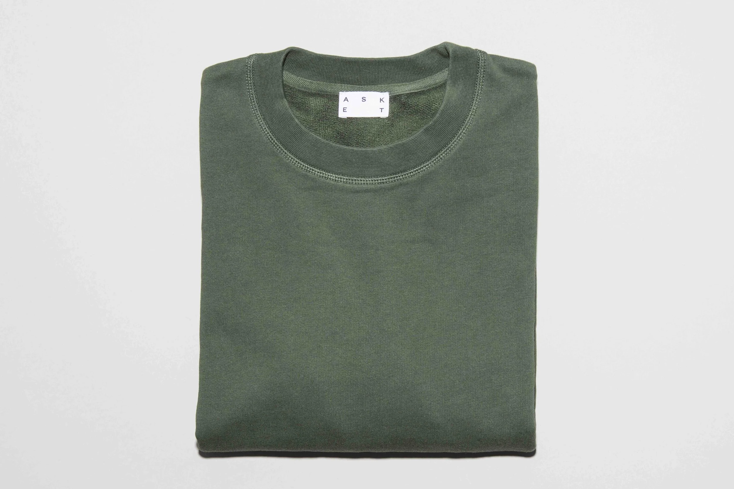
After more than two years of development, design iterations and detailed production, our friends from Stockholm-based menswear brand ASKET have finally released their highly anticipated Sweatshirt. Available in Grey Melange, Navy and Black (followed by a Dusty Green and Burgundy-esque Red this September), the sweatshirt is a minimal take on the original American football player uniform. Cut to a tailored fit from custom developed, unbrushed loopback cotton and stripped from unnecessary details it combines style with unprecedented comfort. Milled and handmade in Reguenga, Portugal.


“Two years of development may seem crazy to some people in this industry. But we're creating garments designed to last a lifetime, and in that context, we say there’s no rush,” says co-founder August Bard Bringéus.
 

Two years may seem long to create a sweatshirt. But it nicely reflects the commitment and values that go into ASKET’s garments. Just over a year ago, the brand released their first take on the sweatshirt, but decided to pull the plug just after a few weeks. It simply didn’t live up to their expectations. So they went back to the drawing board and fine-tuned everything from the fit and fabric to the colours and detailing.

ASKET is Swedish online-only menswear brand founded in 2015 with the mission to free wardrobe essentials from the traditional concept of fashion and bring them back to basics. One garment at a time, the young brand is building a permanent collection of timeless essentials based on honest production, transparent pricing and a new size system

MOEBE – Honest and Intuitive Design

Alex Rückheim

MOEBE Danish Design Studio

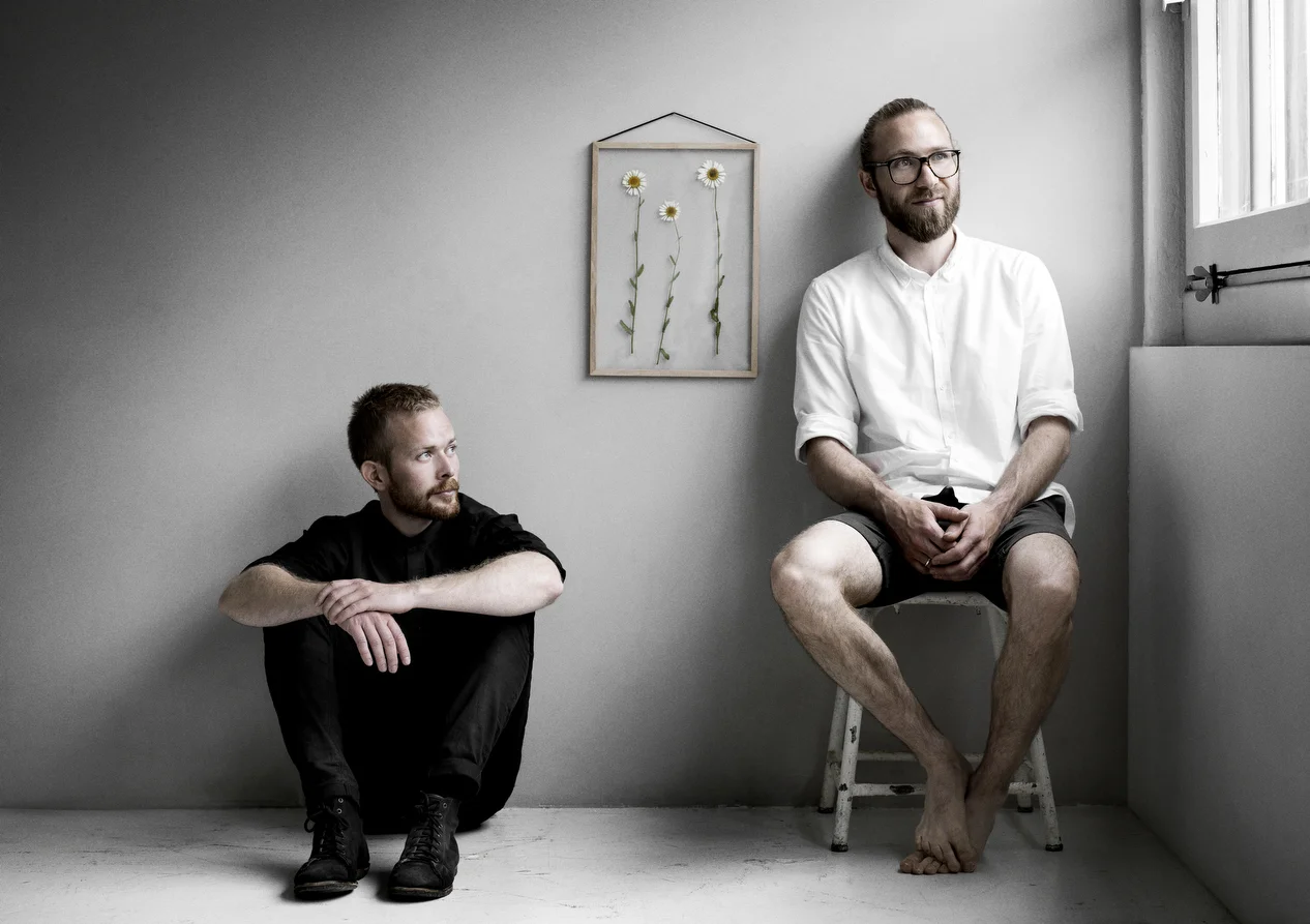
MOEBE is a Scandinavian design studio based in Copenhagen, Denmark, and consists of cabinetmaker Anders Thams and architects Nicholas Oldroyd and Martin D. Christensen.

The beauty about MOEBE is that the studio deliberately keeps things simple, without sacrificing its quality, curiosity, honesty and level of consideration. With a clear focus on the essentials, the brand strives to reduce its designs to their most simple forms, thereby creating intuitive, honest and long-lasting products.

Founded by Anders and Martin over a cup of coffee back in 2014, the name MOEBE derives from ‘Amoeba’ – the single-celled organism, representing the simplicity in their design DNA – and the word ‘Møbel' (furniture), which hints at the type of products the studio designs.
 

“We keep things simple. The world is complex enough.”


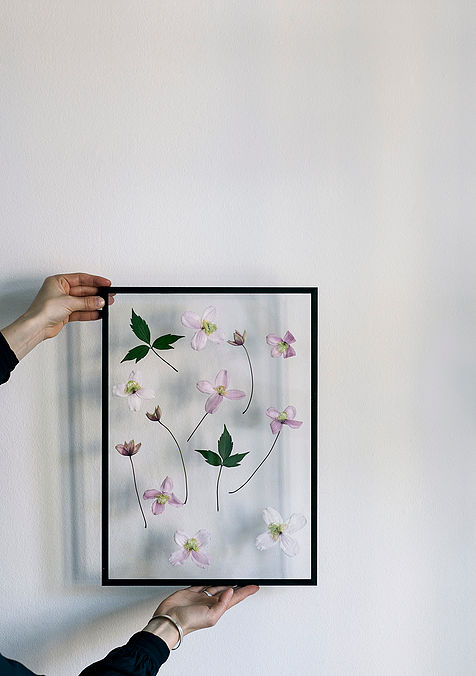
Possibly the most iconic design of the studio – and a personal favourite – is its transparent frames. A re-interpretation of the classic clip-on picture frame, the idea was to reduce it to its core form and make it simpler in its construction and expression while retaining the flexibility of conventional clip-on frames. It consists of two panes of acrylic glass, a frame comprised of four detachable panels of either oak or aluminium (black and white), and a rubber band. The rubber band both holds the frame together and serves for hanging the frame on your wall. The frame is available in A2, A3, A4 and A5 format.

One of the studio’s most recent launches is its beautiful Wall Mirror, a frameless mirror held by a lightweight wire form. In staying true to its core design principles, it is designed by stripping the mirror down to its essential elements. Available in either powder coated black, white or solid brass.

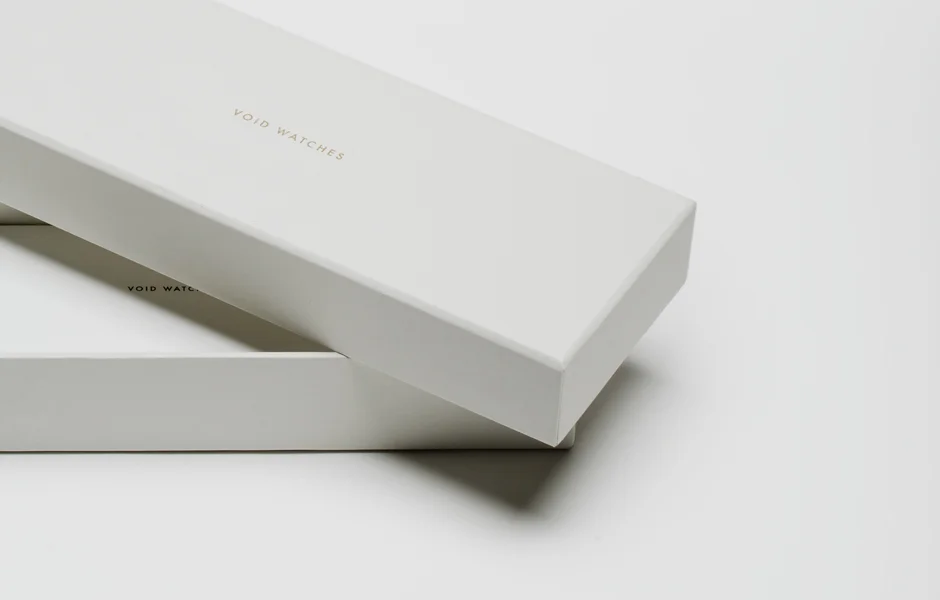
VOID Watches – Introducing the V03D

Alex Rückheim

VOID Watches – Introducing the V03D

Founded by David Ericsson in 2008, VOID Watches is a Swedish design company based in Hong Kong. Launching the watch brand ‘as a bit of side project’ whilst working as an engineer, Ericsson and designer Michael Young have created a range of extensive product ranges since its launch; among them a set of square watches which would later be known as the iconic V01 horizon case that placed VOID Watches on the design map.

Working with geometric shapes, plain materials and a basic colour palette, the brand’s underlying design philosophy employs a form of simplicity and restrained detailing that reflects its Scandinavian heritage. The brand’s name itself is rooted in astronomy; voids are the empty spaces between filaments, the largest structures in the universe, so vast they can neither be seen nor touched, only measured – similar to how the brand perceives the concept of time.  


"A wristwatch symbolises and measures the one commodity we all treasure but can’t control, buy or trade – time” - David Ericsson


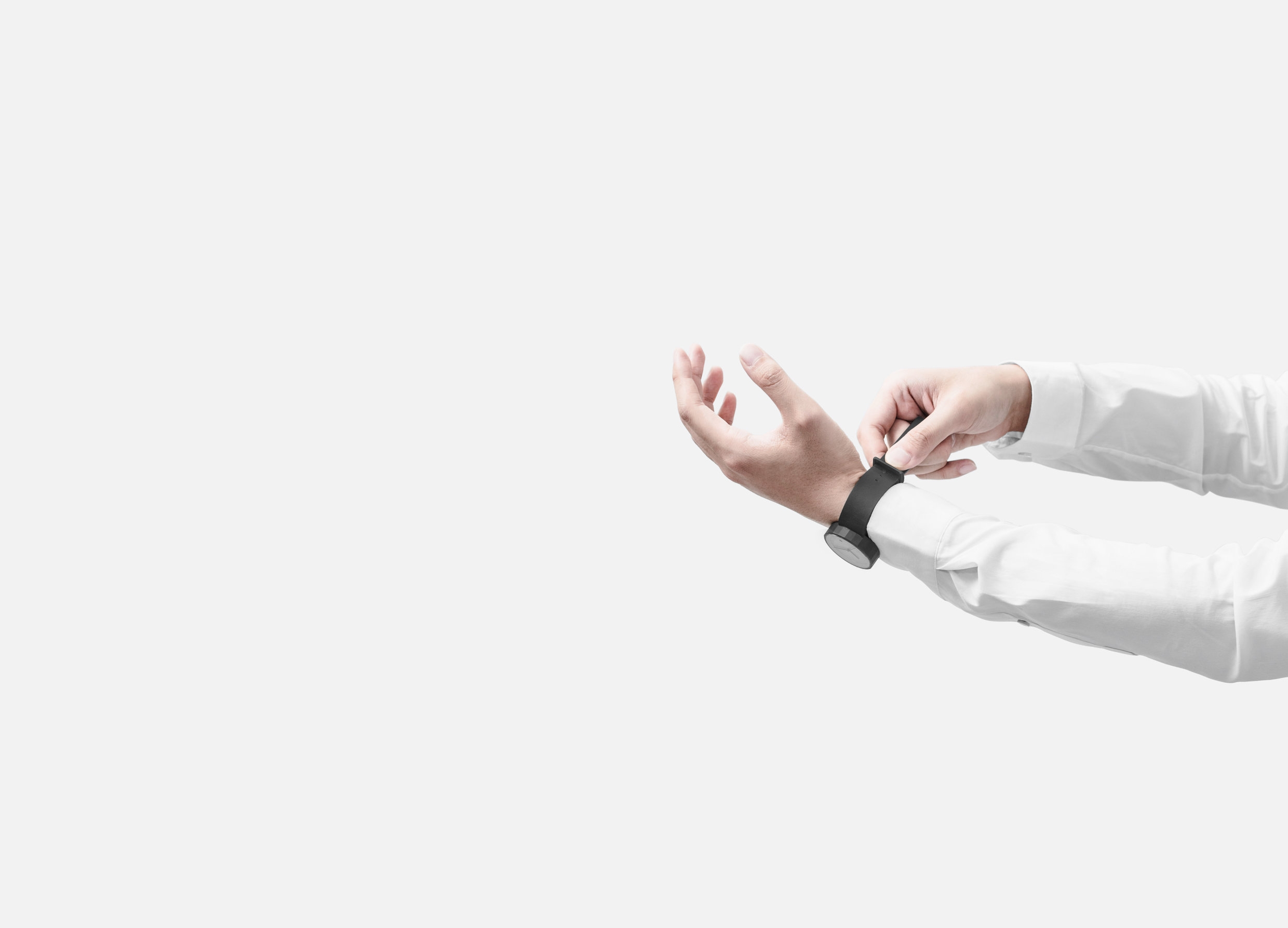
The V03D strikes the perfect balance between form and function. Based on the classic Japanese made 2115 movement from Miyota the watch features three hands and a date window – the most classic layout for analogue wristwatches. The unisex collection is available in a variety of colourways.

Our personal favourite, the V03D designed in collaboration with architecture, interiors and design platform Dezeen. The watch is based on the brand’s classic V03D collection, reducing the graphics of the dial to the bare minimum, opening up space for the hands, for a cleaner, more stripped down dial. "We designed a custom dial, which is the most unique feature on the watch," explains Ericsson. "We stripped it back until it's almost blank," adds Void product designer Patrick Kim-Gustafson. The V03D-DEZEEN is a limited edition piece with only 200 being produced.

Boskke – Urban Gardening Design

Alex Rückheim

Boskke
Boskke
Boskke

With two-thirds of the global population expected to live in urban cities by 2050, people are increasingly looking for ways to reconnect with nature. After all, 82% of people in the UK say being surrounded by greenery makes them feel happier. But with life moving faster than ever, time and also space are increasingly limited. Boskke (meaning ‘little forest’ in old English) therefore set out with the mission to find new ways to gardening that appreciate the challenges of city living and to encourage greenery in our cities, homes and workplaces. “Boskke is derived from the old English word ‘bosky’ which means ‘a small forest’,” says Boskke cofounder Patrick. “And that’s exactly what you can create with our intelligent, eco-sensitive designs.”

Boskke is a London-based urban gardening product design firm that is not only one of the pioneers of ceiling gardening, but the studio has been developing urban gardening products since 2009. Co-founded by Patrick and Jake Morris, the two brothers hail from Matakana, New Zealand, where their family runs Morris & James, the country’s leading producer of hand-made ceramic pots and homewares. “Our parents have been making garden pots since 1977, so we grew up with ceramics,” says Jake. “Boskke is a continuation of our family heritage, but with a contemporary angle.”

The brand’s signature piece is the Sky Planter that Patrick designed in the final year of his degree in ceramic design at Central Saint Martins – the design won him the New Designer 2008 Award and the Red Dot Award in 2011.

In February, Boskke launched Flipped – a new planter that is both playful and deliberate in its design. Inspired by the way traditional plant pots are often stacked upside down when they’re not in use, the outer body works as a water reservoir, supplying moisture to the plant for up to two weeks using Slo-Flo irrigation technology.

STEPHEN & LEO CHI - Chi and Chi Studio, Taiwan

Alex Rückheim

Chi and Chi Studio, Taiwan
Chi and Chi Studio, Polygon Watch, Taiwan
Chi and Chi Studio, Memo Bank, Taiwan
chi and chi design watch
Chi and Chi Studio, Taiwan
Chi and Chi Studio, Taiwan design

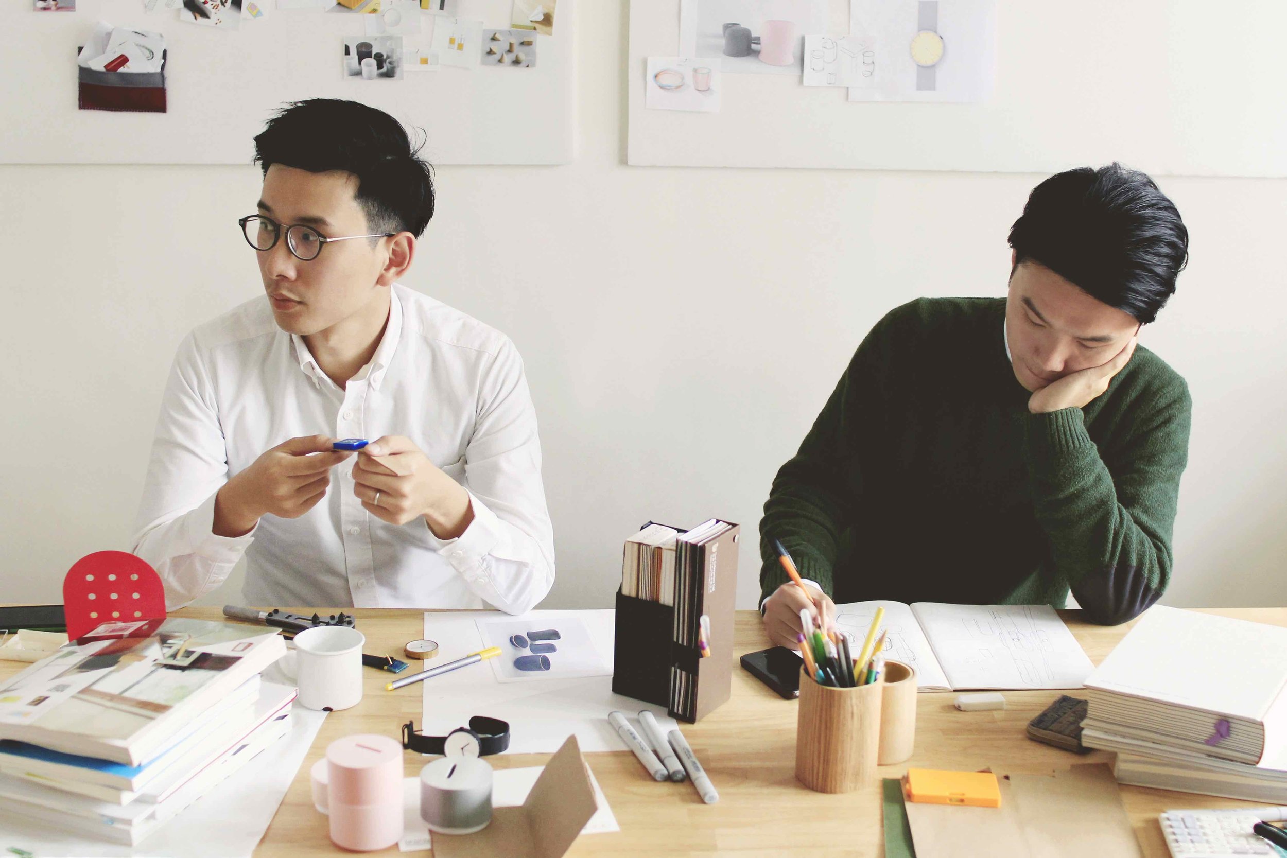
Chi and Chi is a Taiwanese design studio that was founded by brothers Stephen Chiu Chi Hung and Leo Chiu Chi Tat in 2013. Formerly full-time designers for other studios, the two Hong Kongese brothers decided to set up their own studio, driven by a desire to develop a better understanding of products’ lives and to work more closely with manufacturers. “The meaning behind an object should come first – its story, its interesting facts and its uniqueness,” says Stephen.

The duo pays close attention to the relationship between people and objects. Taking inspiration from everyday – often forgotten or ‘normalised’ – objects, Chi and Chi aim to create and redesign objects with content and purpose; with simple functions in their essential forms; that look nice, work well and make someone’s day happier.

The Polygon watch – the studio’s signature piece – is a modern 24-sided analogue timepiece. Each side of its unusual faceted case corresponds to an hour of the day. The watch is designed with geometric features and made with precision engineering and careful hand polishing. Unlike the usual round and smoothened contours of regular watches, Chi and Chi’s Polygon watch preserves the ‘edges’, thereby presenting the time in a distinctively different yet aesthetic way.

For Chi and Chi, working closely with its manufacturers is an integral part of the creative process, and the studio had initially struggled to find a watchmaker able to produce the Polygon’s geometric silhouette. “At the beginning, several manufacturers turned us down because it was too difficult to make,” explains Stephen. “We almost needed to redesign the whole watch.” Instead, the studio has now successfully launched its second edition of the Polygon series.


“The reason we set up the studio is to have a better understanding on product life, not merely to design an object. We can work closely with manufacturers, create something cool with clients and have more interaction with the customers.”
 

Meanwhile, Chi and Chi is partnering with brands and creatives on designing new products set to launch in early 2017, including tableware and home accessories. Make sure to scroll down the page to view a personal selection of the brothers' favourite works of art, artists and products as well as the things that inspire them.
 

@chiandchico 

chiandchi.com


The composition of images below is a personal selection of Stephen and Leo Chi's Favourite Works of Art, Favourite Products and the things that inspire them.


by Clay Mahn

by Clay Mahn

Arne Jacobsen, Tongue Chair

Arne Jacobsen, Tongue Chair

Harry Bertoia, Silver Teapot, 1940

Harry Bertoia, Silver Teapot, 1940

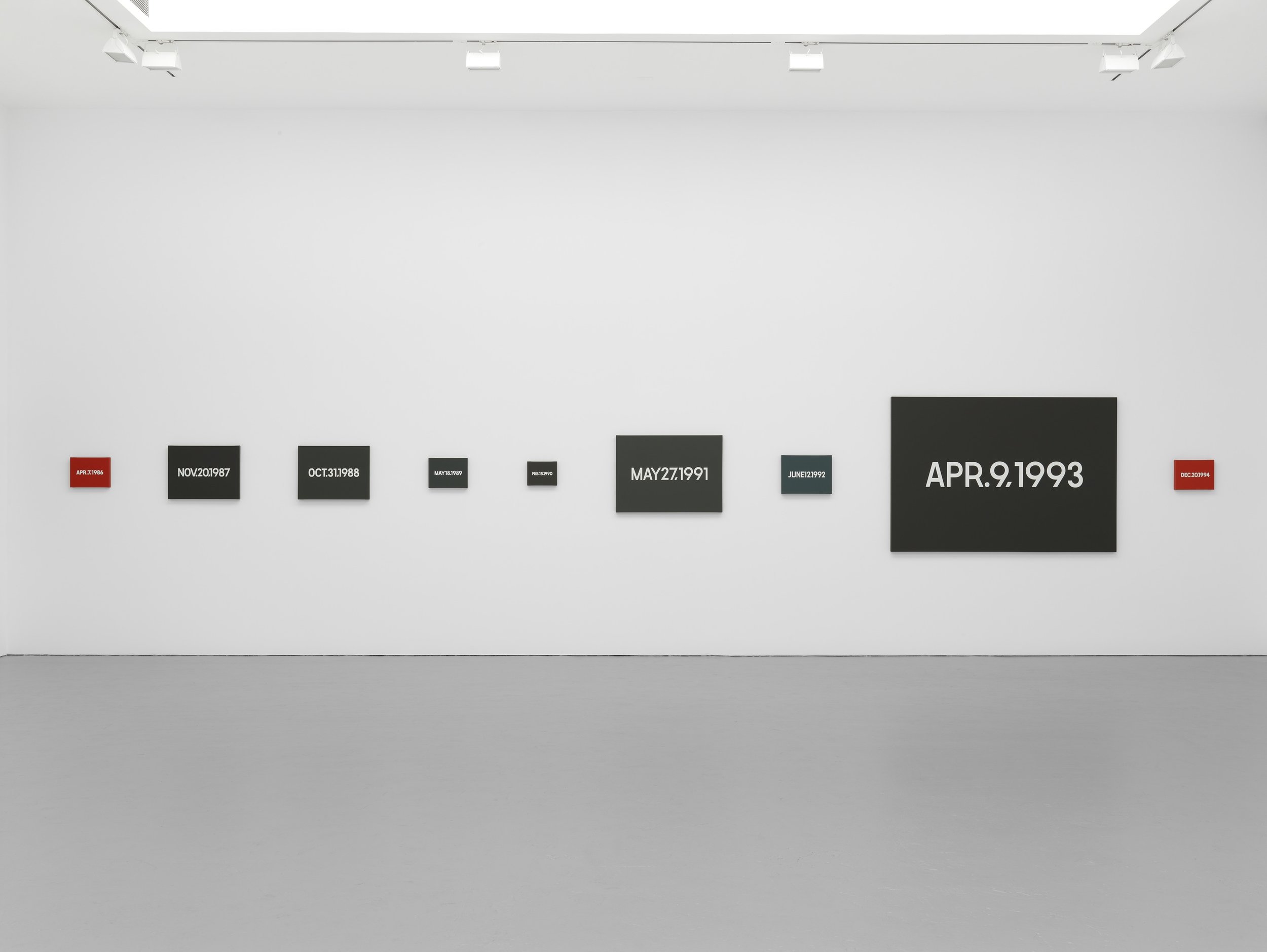
On Kawara, Date Painting(s)

On Kawara, Date Painting(s)

Lucie Rie, Conical Porcelain Bowl

Lucie Rie, Conical Porcelain Bowl

Floris Hovers, CARtools

Floris Hovers, CARtools

Sabine Finkenauer, Sculpture-sample, 2010

Sabine Finkenauer, Sculpture-sample, 2010

Designed by Dieter Rams 

Designed by Dieter Rams 

Paul Winstanley, Art School 16, 2013

Paul Winstanley, Art School 16, 2013

Harry Gitlin,Table Lamp, Model T9, 1951

Harry Gitlin,Table Lamp, Model T9, 1951

Marcel Breuer, Cesca Side Chair (model B32), 1928

Marcel Breuer, Cesca Side Chair (model B32), 1928

Josef Alvers, Never Before a, 1976

Josef Alvers, Never Before a, 1976

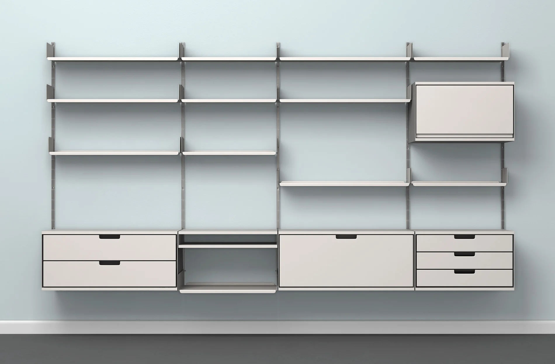
Bruno Mathsso, MI 1050 Wall Unit

Bruno Mathsso, MI 1050 Wall Unit

Daniel Steegmann Mangrané, Cripsis, 2013

Daniel Steegmann Mangrané, Cripsis, 2013

Tadao Ando - Architect

Tadao Ando - Architect

Designed by Naoto Fukasawa 

Designed by Naoto Fukasawa 

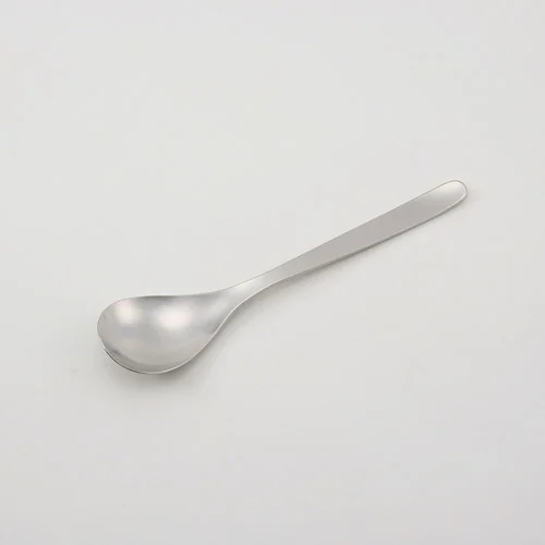
Sori Yanagi, Spoon

Sori Yanagi, Spoon

Izziyana Suhaimi, Reaching for equilibirum

Izziyana Suhaimi, Reaching for equilibirum

Molded Pentray by collaboration brand "PH" (HIGHTIDE and PAPIER LABO)

Molded Pentray by collaboration brand "PH" (HIGHTIDE and PAPIER LABO)

Kaj-Franck, Kilta

Kaj-Franck, Kilta

Walter De Maria, Tryth / Beauty Series

Walter De Maria, Tryth / Beauty Series

YSTUDIO - Handcrafted Ballpoint Pen

Alex Rückheim

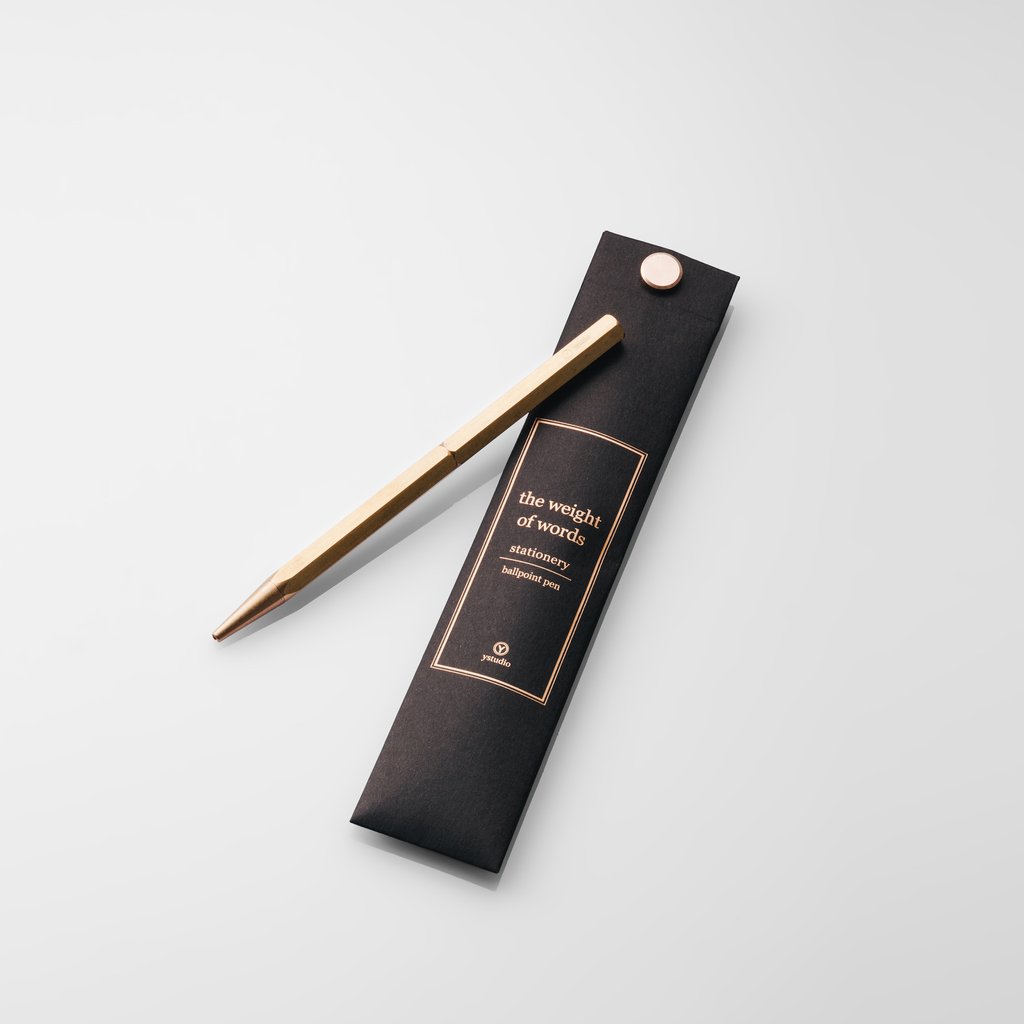
Ystudio - Ballpoint Pen

Founded in Taiwan in 2012, Ystudio’s pens have become a staple piece in our office. For us, the studio’s ballpoint pen not only stands out for its quality and aesthetic, but also for the story it tells; designed and crafted to be lifetime stationery piece.
Seeking to design stationery objects that link past memories with modern life, Ystudio’s copper, bronze and brass pens are made to last a lifetime – with the thought of being passed down from generation to generation.


'In the hands, the brass, with the intense golden yellow, is gradually mild, deep with the ages, and piles up forefathers’ works full of wisdom; the feel, a bit heavy, always reminds us that we should honestly be responsible for every character we have written down.'


Founders Yi and Yanko believe in the value of simplicity. With a considered approach to object design – one that has a meaning; one that is intended to trigger people’s imagination; and one designed to be a part in people’s lives – each of Ystudio’s pens is hancrafted by local, Taiwanese craftsmen using traditional manufacturing techniques under the scorching heat in a furnace.

SEEM SOAP STUDIO - Product Design Duo, Paris

Alex Rückheim

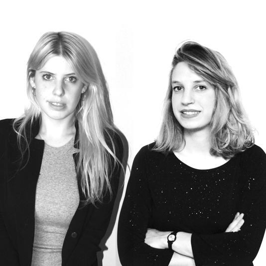
Portrait - Seem Soap
Portrait - Seem Soap design
seemsoap design
papiertigreseemsoap

Mathilde Lehmann and Valentine Sée are the founders of Paris-based Seem Soap Studio. After completing individual studies in Strasbourg and Geneva, the two young women decided to open their own studio in 2015 after crossing paths in Paris. We met the trained plastician and product designer in Paris to talk about their work, their approach to product design and the importance of everyday objects.

Mathilde and Valentine are fascinated by working with functional everyday objects that seem often forgotten. Experimenting with natural colour pigments, various moulds and 3D printed shapes, the duo approaches the everyday mundane in completely new ways – often bridging the gap between design, art, sculpturing and functionality.  

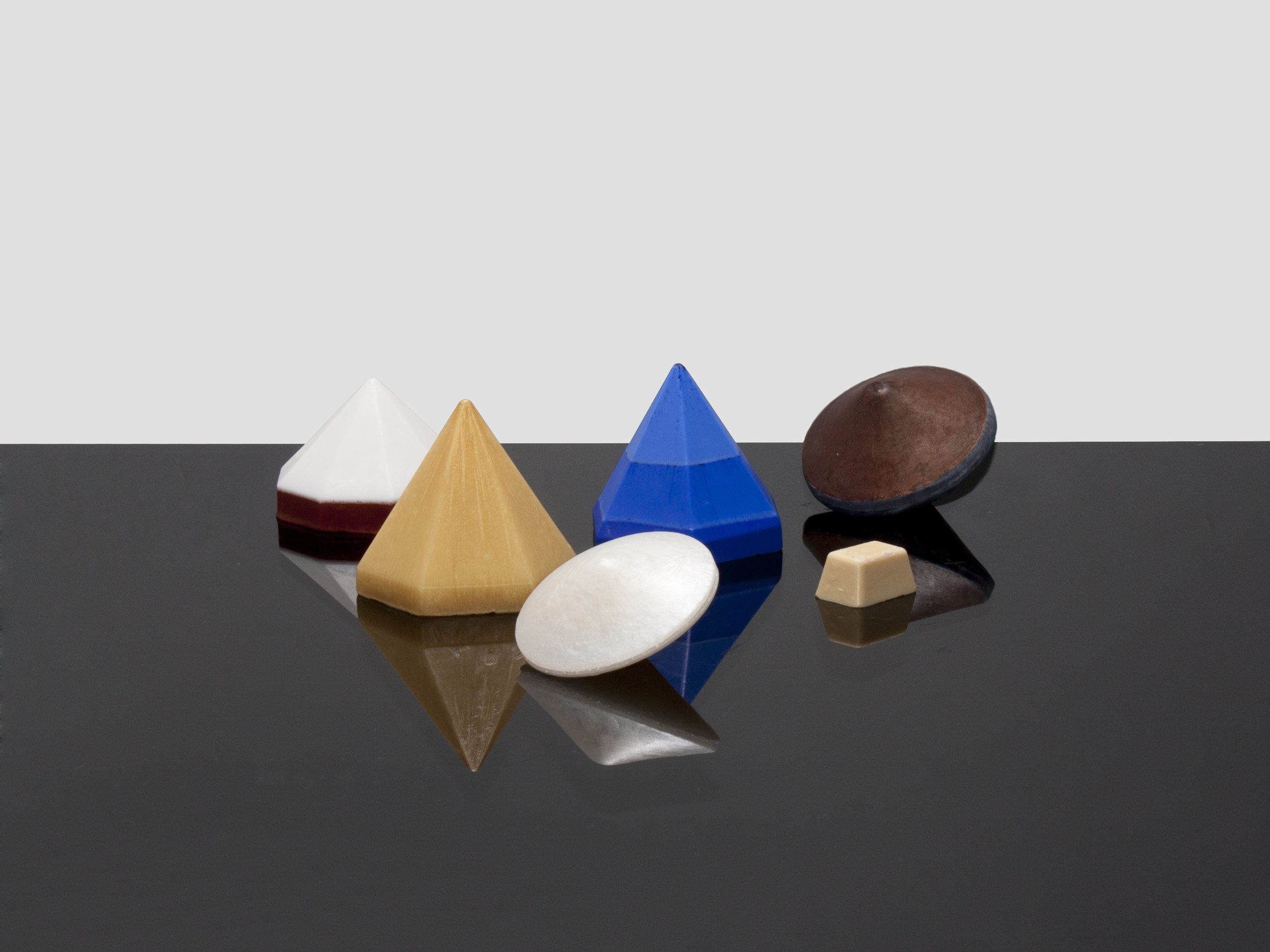
What had started as an experiment, ended up in their first collection, which the studio launched at Paris Design Week in 2015. Taking a new approach to soap, the duo questions and explores the function of this, often unnoticed, object, reimagining it as a sculpture that adopts new states as time passes. Seem Soap’s four collections – Songe, Patience, Vertige and Paradoxe – apply this careful consideration of product design. Made with a vegetable soap base and formulated with natural ingredients and pigments, the artisan soaps are not only fragrance and allergen-free, but also ergonomically shaped to fit your hand with ease. Mathilde and Valentine make up to twenty soaps per day by hand in their Paris based studio.


Today, soaps are everyday objects; and their shapes have developed into something quite standardised. We wanted to push the boundaries of new approaches in conception and production.


Seem Soap have recently been added to the selections of WallpaperStore*, Papier Tigre and the London Design Museum and have launched an exclusive collaboration with Emily Marant


@seemsoap

seemsoap.fr


The composition of images below is a personal selection of Mathilde and Valentine's Favourite Works of Art and the things that inspire them.


Thevoz Choquet for Bloc Studios - Marmo Domestico Collection N°1 (2015)

Thevoz Choquet for Bloc Studios - Marmo Domestico Collection N°1 (2015)

Ladies & Gentlemen - Scales & Folds (2015)

Ladies & Gentlemen - Scales & Folds (2015)

Delpozo SS15 Backstage (2014)

Delpozo SS15 Backstage (2014)

Studio Swine, Hair Highway (2014)

Studio Swine, Hair Highway (2014)

Henri Matisse - Formes, PL. IX (from Jazz, 1947)

Henri Matisse - Formes, PL. IX (from Jazz, 1947)

Hella Jongerius - Gemstone Tables (2013)

Hella Jongerius - Gemstone Tables (2013)

Aude Pariset and Juliette Bonneviot - Last Spring/Summer IV (2015)  

Aude Pariset and Juliette Bonneviot - Last Spring/Summer IV (2015)  

Éléonore Delisse - Day & Night, Lights (2015)

Éléonore Delisse - Day & Night, Lights (2015)

Gustaf Nordenskiöld - Beardrops, Ceramics (2011)

Gustaf Nordenskiöld - Beardrops, Ceramics (2011)

Louise Zhang - Slosh Samples (2014)

Louise Zhang - Slosh Samples (2014)

Dephine Coindet - Modes et usages de l'art (2015)

Dephine Coindet - Modes et usages de l'art (2015)

Delpozo, Resort 2017 Collection (2016)

Delpozo, Resort 2017 Collection (2016)

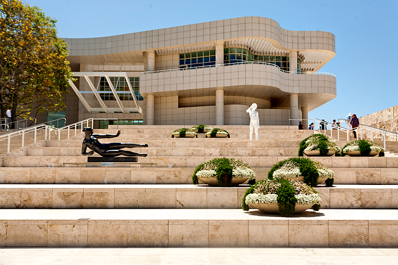
The Getty Museum - Los Angeles

The Getty Museum - Los Angeles

Celia Hannes - Emissaire, Glass Objects (2013)

Celia Hannes - Emissaire, Glass Objects (2013)

Botanical Gardens, Geneva

Botanical Gardens, Geneva

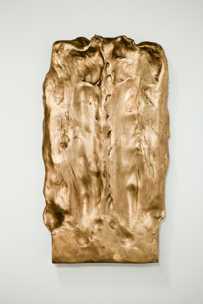
Camille Henrot - Sculptures Massées (2011) 

Camille Henrot - Sculptures Massées (2011) 

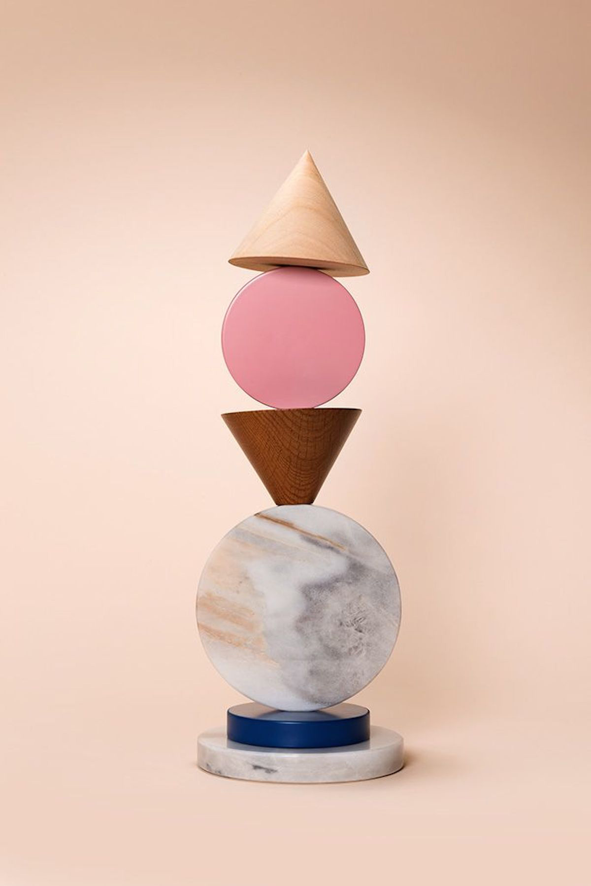
Tomas Alonso - Lines & Waves, Marble (2014)

Tomas Alonso - Lines & Waves, Marble (2014)

Epiforma - Meanwhile Curiosities: A Conceptual Representation of Time (2015)

Epiforma - Meanwhile Curiosities: A Conceptual Representation of Time (2015)

Pierre Charpin - Oggetti Lenti, Vases (2005)

Pierre Charpin - Oggetti Lenti, Vases (2005)

Anny Wang - Treasures (2016) 

Anny Wang - Treasures (2016) 

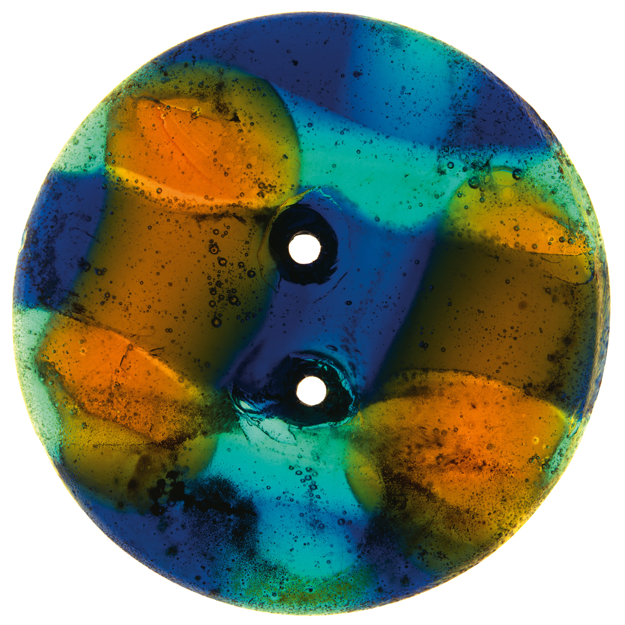
Button - "Déboutonner la Mode" (2015)

Button - "Déboutonner la Mode" (2015)

Philippe Jarrigeon - Baccarat, Harcount Bday (2011)

Philippe Jarrigeon - Baccarat, Harcount Bday (2011)

Bruno Peinado - Sans titre, Looking for a certain ratio (2014)

Bruno Peinado - Sans titre, Looking for a certain ratio (2014)

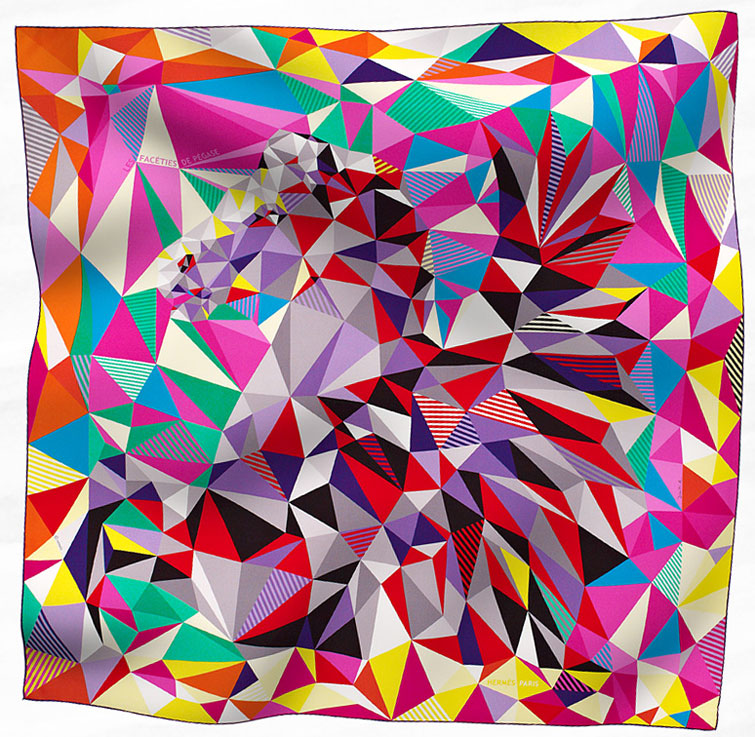
Hermès - Les facéties de Pégase

Hermès - Les facéties de Pégase

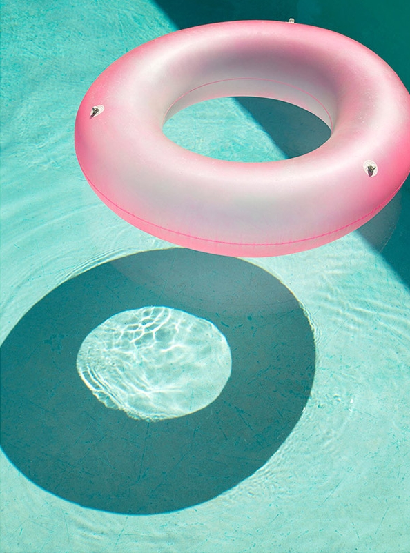
George Byrne - Hotel Pool (2015)

George Byrne - Hotel Pool (2015)

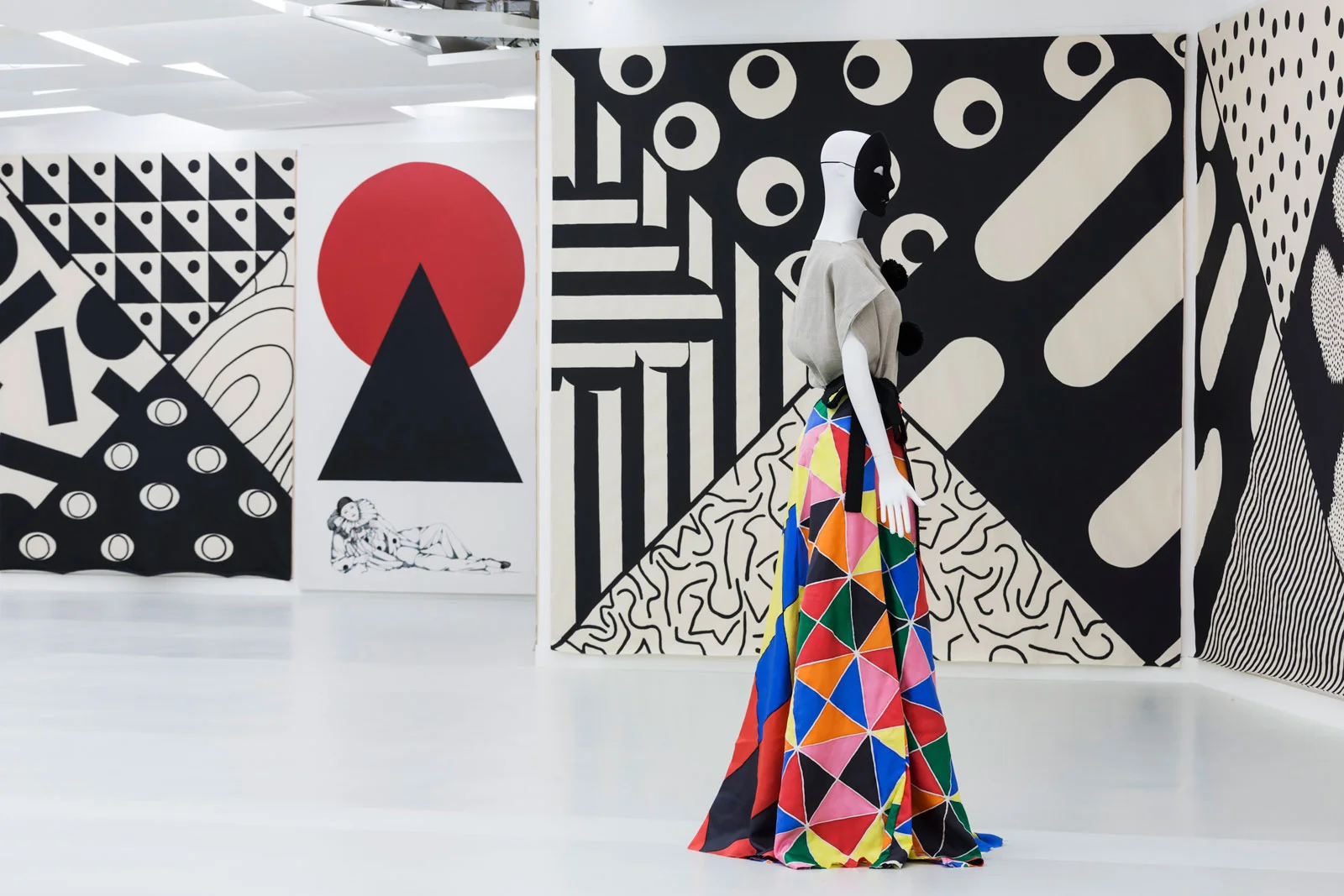
Karina Bisch - Arlequine (2015)

Karina Bisch - Arlequine (2015)

Vitsœ - The Power of Good Design | FREE Copy

Alex Rückheim

Vitsœ currently offers three products designed by Dieter Rams: the 606 Universal Shelving System, the 620 Chair Programme and the 621 Table.

To celebrate the design principles coined by Dieter Rams, Vitsœ have published a pocket-sized compendium detailing these very principles – the ethos that underlies each and every step of the company.

Vitsœ and GOODS WE LIKE have teamed up with the aim to spread this design ethos as far as possible, making the publication accessible to everyone.

Note: the send-out of the free copies has now ended. If you wish to request a copy, please get in touch directly with Vitsœ.

--

Founded in 1959 with the aim to allow more people to live better with less that lasts longer, renowned furniture company Vitsœ has consistently stood up to a world that appears to value only things that are new. For this reason, the London-based brand set out with the mission to make long-living furniture; always seeking to be better rather than newer. 


Live better with less that lasts longer.


The beauty about Vitsœ is that the company designs, makes and evolves furniture that lasts for generations. Based on this principle, Niels Vitsœ and Otto Zapf decided to establish a company to realise the furniture designs of Dieter Rams – known for his unobtrusive approach and belief in “less but better”. As one of the foremost industrial designers of the 20th century, the former Braun designer has not only shaped the Functionalist school of industrial design, but his design principles have been – and still are – an inspiration to a whole generation of designers.

Becoming increasingly concerned by the state of the world around him, Rams asked himself probably one of the most important questions in his career: is my design good design? As good design can’t be expressed in finite terms, he set about expressing the ten most important principles for what he considered was good design. This chain of thought resulted in what is known as The Ten Principles for Good Design.

INSTRMNT - a Minimalist Steel Watch

Alex Rückheim

Instrmnt - Minimalist Steel Watch

Introducing Glasgow-based design studio Instrmnt. Founded by Pete Sunderland and Ross Baynham, the focus of the young multi-disciplinary team lies in creating considered, user-led products for every-day use.

We took a closer look at the studio’s debut product range – Instrmnt 01, a minimalist steel watch that takes inspiration from the industrial design of the mid 20th century. With a strong interest in the functional, utilitarian products and tools produced during that time period, you will find design cues ranging from the simple, readable dials and analog ammeters and voltmeters to the revolutionary minimalism of Dieter Rams.


We thought, we're designers, we love watches, why don't we make the watch that we want to wear? Why don’t we make the watch that is perfect for us?


The layout of Instrmnt 01 has quickly become an iconic part of the brand. And one of the beauties when receiving the watch lies in that it ships unassembled with tools provided for you to assemble the watch yourself. Another key principle lies in the use of high quality materials alongside trusted, proven technology. Instrmnt 01 comes in four different colourways (01-A, 01-B, 01-C, 01-D) and features a Swiss Quartz Ronda 585 3H movement, a calf leather strap crafted by one of the last remaining leather strap manufacturers located in the Bavarian Forest, and recyclable packaging manufactured in the UK.


The watch comes 'exploded' so you get pins, the casing, strap parts and a tool, which are nicely laid out. It's like an instrument that you put together.


Since its launch in 2014 further products have followed, including a 2-speed city bike built in collaboration with Freddie Grubb and an initial foray into furniture design with the creation of a multi-purpose day bed which was designed in collaboration with Edinburgh-based craftsman and furniture maker Namon Gaston.

Ultimately, what you will be wearing around your wrist is a beautiful watch that has been designed with consideration and precision – a watch that pairs high quality components with simple, utilitarian design. “We want to know the time and the date. That’s it.”