Contact Us

Use the form on the right to contact us.

You can edit the text in this area, and change where the contact form on the right submits to, by entering edit mode using the modes on the bottom right. 


123 Street Avenue, City Town, 99999

(123) 555-6789

email@address.com


You can set your address, phone number, email and site description in the settings tab.
Link to read me page with more information.

GOODS WE LIKE

GOODS WE LIKE

ASKET – Launching Two New Wardrobe Essentials

Alex Rückheim

ASKET Wardrobe Essentials

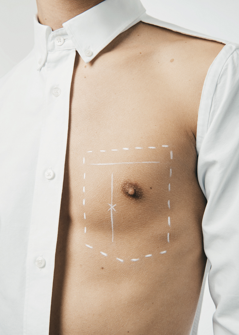
In the course of the last few months, our friends from Stockholm-based menswear brand Asket have added two new wardrobe essentials – one garment at a time – to their permanent collection of timeless classics: The Pique Polo and The Oxford Shirt.

Their classic Oxford button down shirt as well as their latest addition, a classic pique Polo, are both available in Asket’s revolutionary 15 size system. The brand’s sizing system caters to a larger variety of body shapes and a wider set of personal preferences, truly re-thinking and democratising modern garment sizing (find out more here). 

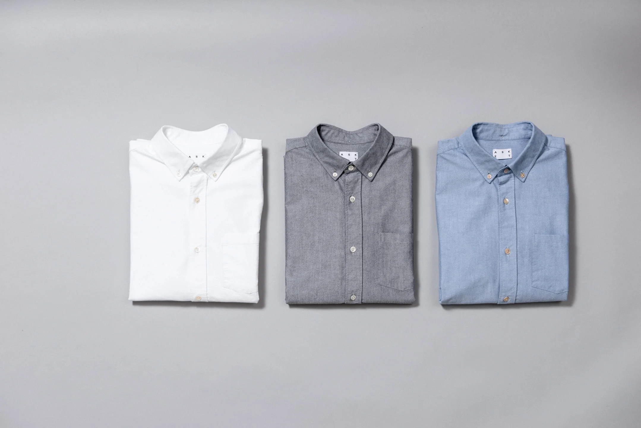
As the very definition of a true wardrobe staple, Asket has designed a beautiful button down shirt, cut from heavy Oxford cloth that is comfortable, resilient and fitted with mother of pearl buttons. The Swedish brand has entrusted a family run shirt factory in Portugal to handcraft their take on the classic Oxford Shirt. (Available in three colours)

With a minimalistic and modernised take on the classic polo shirt, Asket’s Pique Polo is improved in both form, fit, drape and function. A heavier, more luxurious pique knit fabric offers more comfort and durability, while tonal mother of pearl buttons and a nicely ribbed collar round off this sporty classic. (Available in four colours)

MONOCLE – How to Make a Nation: A Monocle Guide

Alex Rückheim

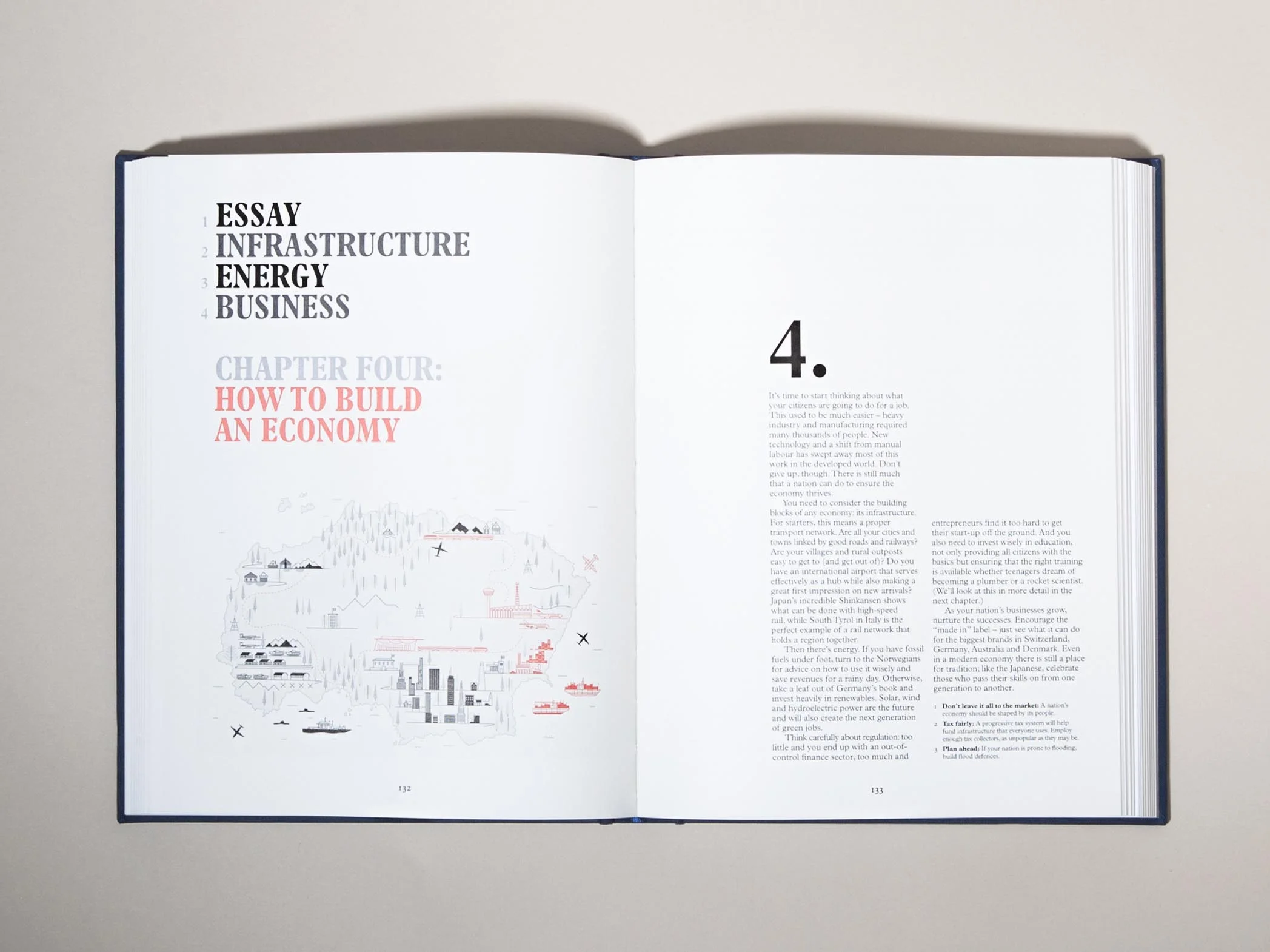
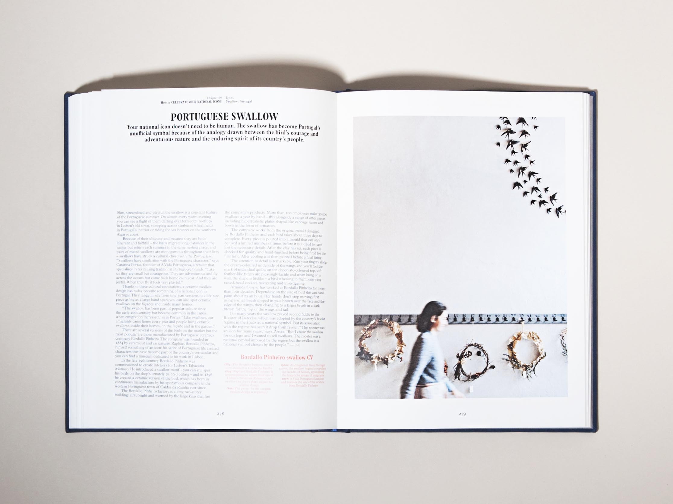
MONOCLE How to Make a Nation A Monocle Guide

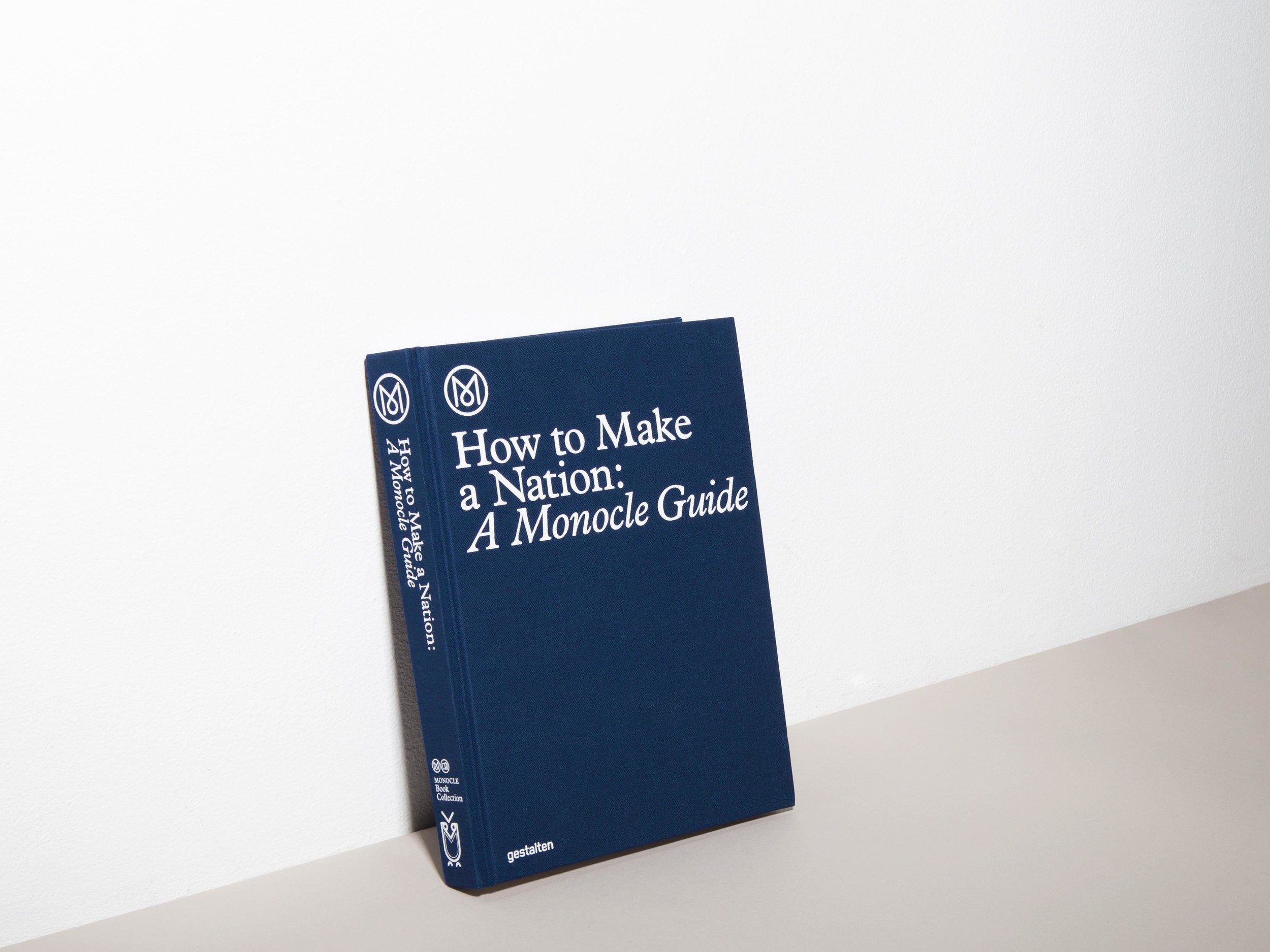
We took a closer look at Monocle’s new thought-provoking publication – ‘How to Make a Nation: A Monocle Guide’.

How do you create a country? What characteristics and values define a country? Which are particularly successful in terms of education, economics, or culture? In this book, Monocle provides a global perspective on 338 pages on the distinct qualities of nations. Who’s getting it right, and who’s not? Monocle dispatched writers and photographers to more than 50 countries to explore this question; and to provide a series of benchmarks to answer it. They met people who are creating extraordinary things – and we’re not just talking about institutions at a state level here, nor exclusively economics and politics, but also culture, community, education, identity and design.

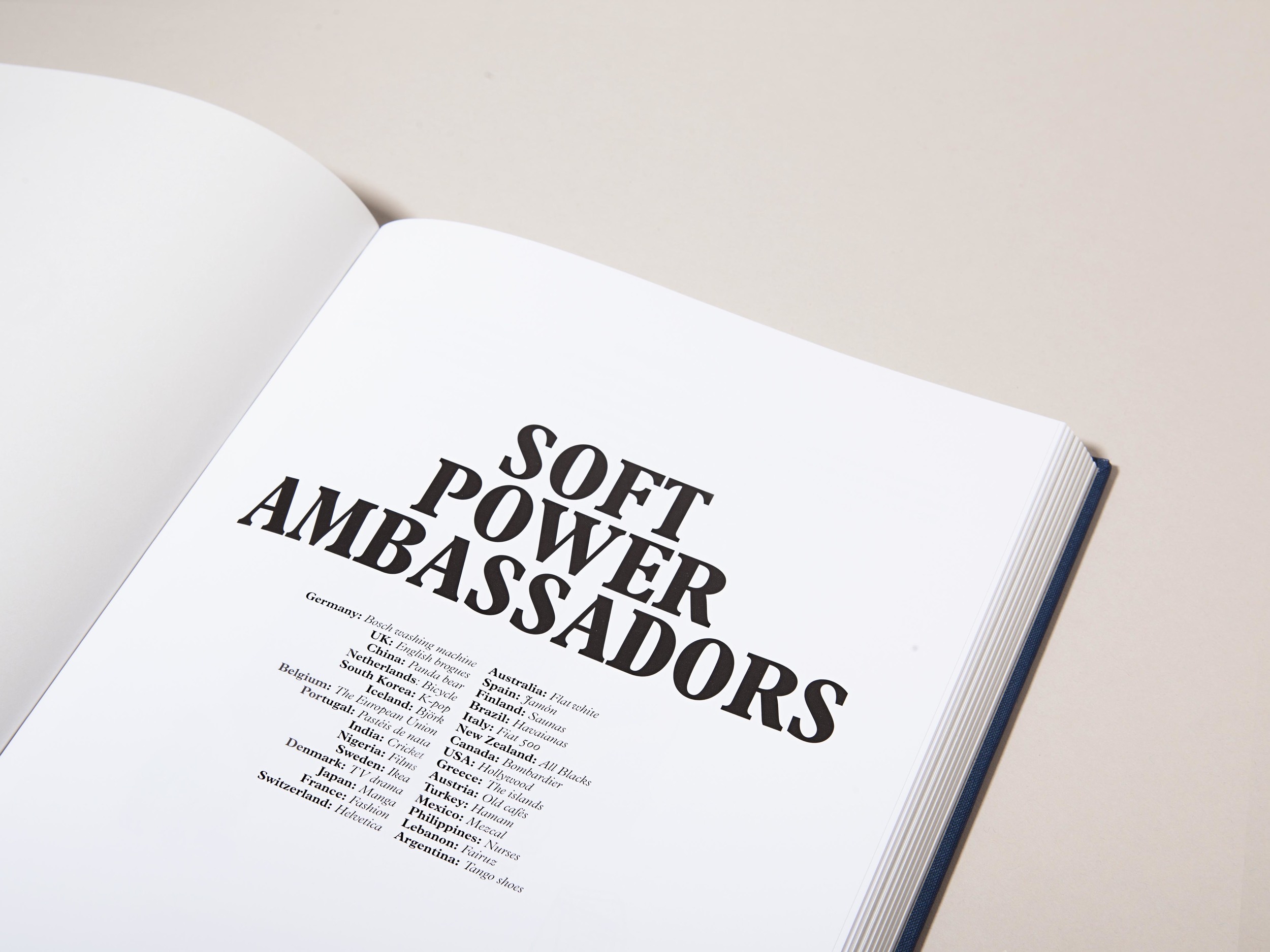
The book is divided into 10 sections, which explore a nation’s governance, diplomacy, safety, economy, community, soft power (cultural capital), culture, sport, national icons and national branding. Each chapter is introduced through a compelling essay, followed by great editorial insights, stories, infographics and photo essays. 

Since its launch in 2007, Monocle has consistently reported on global affairs, business, culture and design. How to Make a Nation is a great book that informs and inspires. Published by Gestalten.

Photographed by Ali Baïlon for GOODS WE LIKE.

CINQPOINTS – Architectural Stationery and Toys

Alex Rückheim

cinqpoints
cinqpoints
GWL 28 may Ali 20050.jpg
cinqpoints

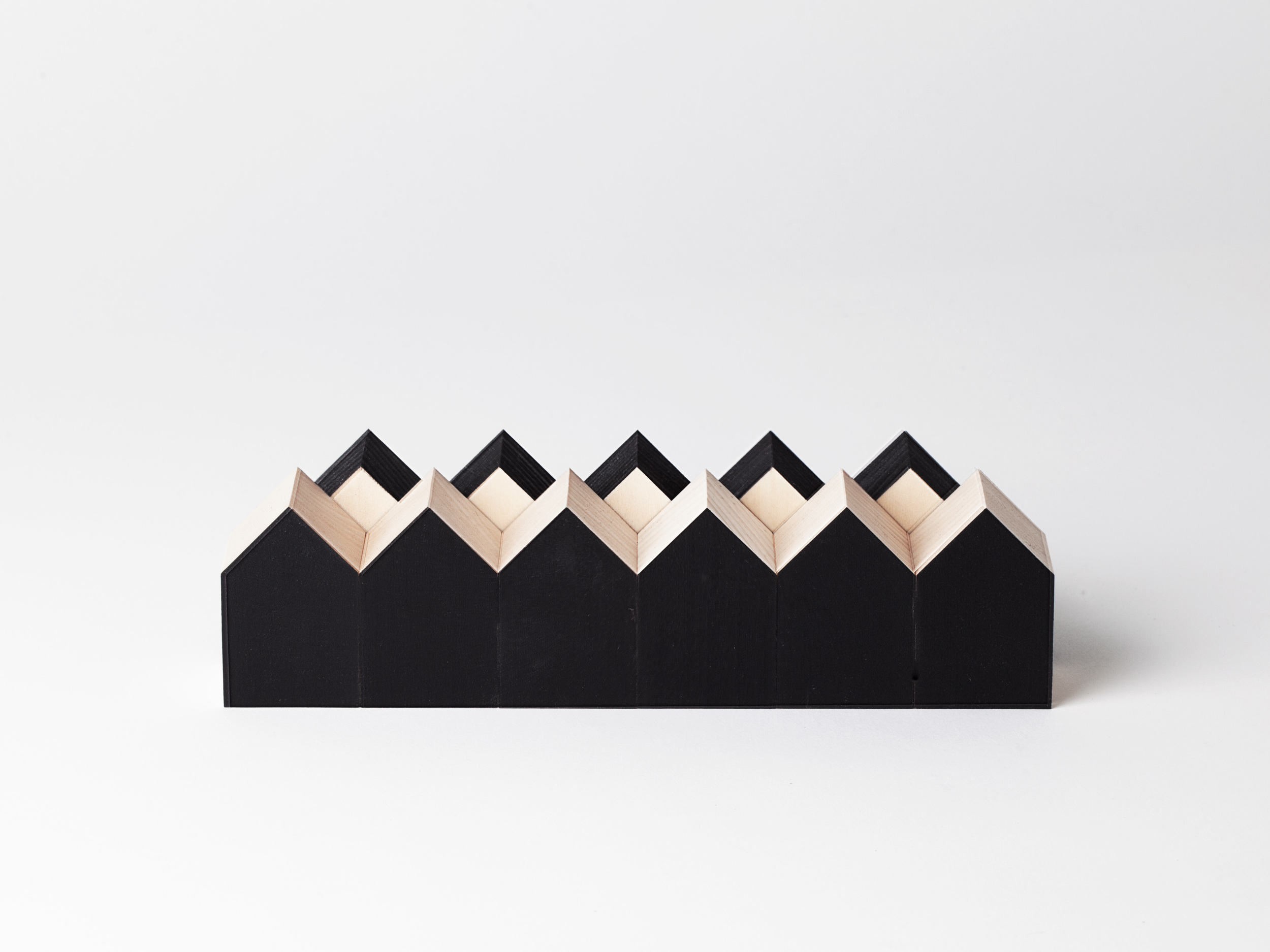
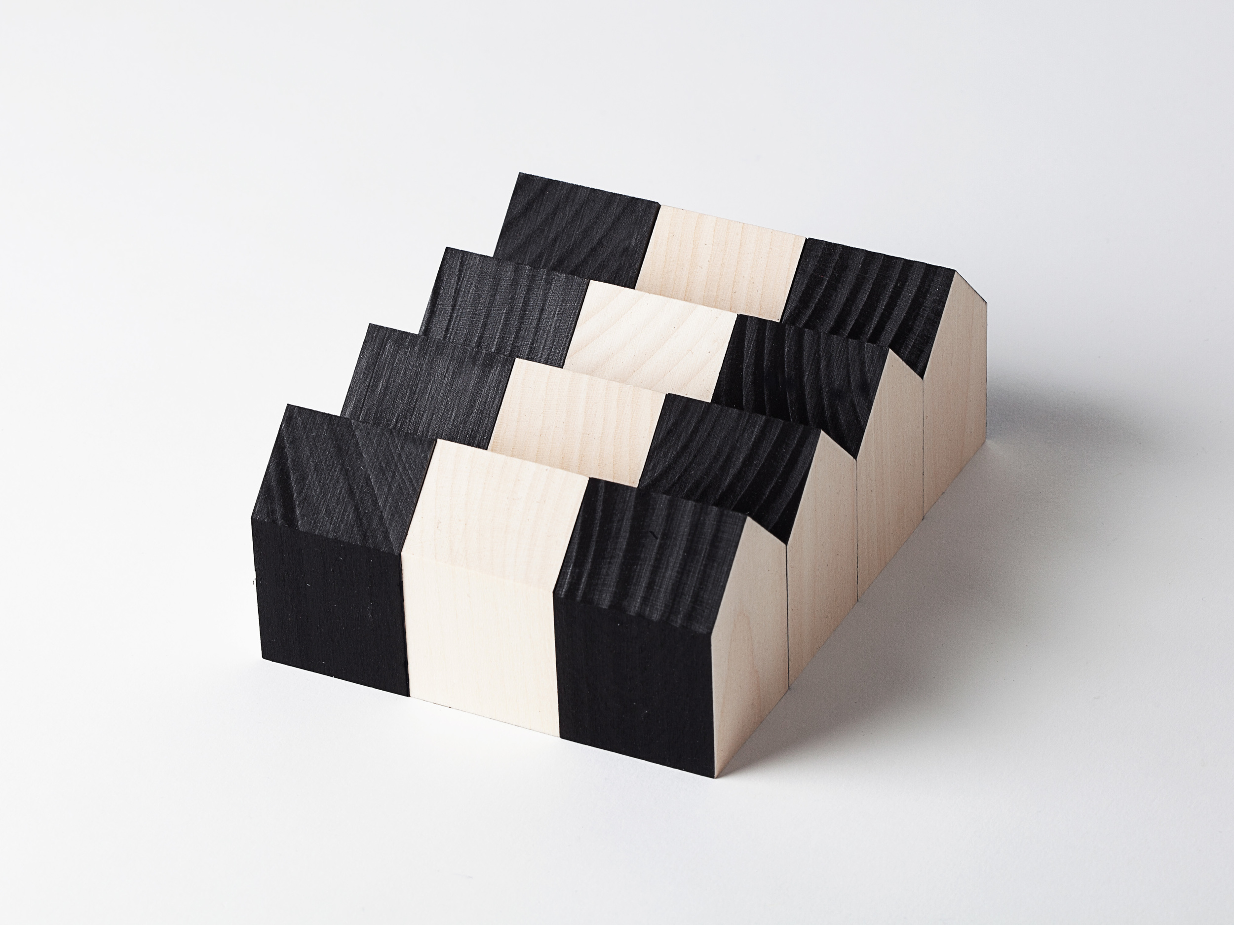
One of our most recent discoveries is Cinqpoints - a French company that designs and produces stationery objects and toys. What makes the brand stand out is not only their truly refined and clean design aesthetic, but their mission to spread contemporary architecture to a larger audience. In so doing, Cinqpoints intriguingly combines playfulness, curiosity and imagination with contemporary culture, design and architecture.

Archiblocks is a construction set of building blocks created for both adults and children. Designed by Laurence Calafat for Cinqpoints, the set creatively as well as intelligently follows the formula of form + balance + composition + inspiration = architecture. The result being a modern16-piece set of smooth, precision-cut, untreated blocks that allows you to experiment with modularity, volume, balance and compositions. Material: untreated, natural lime-wood. Comes in three different style: natural, black and white.

Photographed by Ali Baïlon for GOODS WE LIKE.

INTERNOITALIANO – Neri Stationery Objects

Alex Rückheim

INTERNOITALIANO – Neri Stationery Objects
INTERNOITALIANO – NERI Stationery Objects

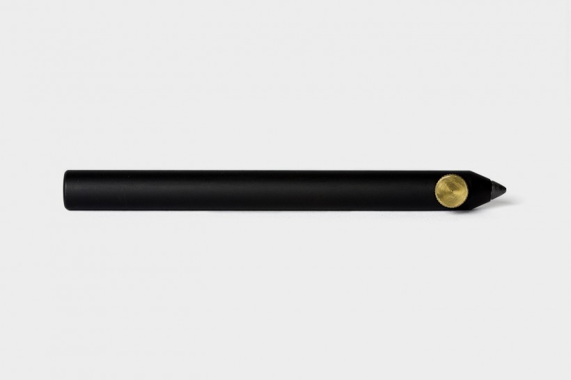
NERI is a collection of pens and mechanical pencils designed by Italian designer Giulio Iacchetti for InternoItaliano. The brand’s stationery and desk objects fall outside the traditional mechanism of the opening/closing systems of classic pens: the placement of the leads as well as the regulation of their length is done by simply turning the contrasting thumbscrew.

Founded in 2012 by Giulio Iacchetti, InternoItaliano designs furniture and design objects inspired by the Italian culture and way of living. At the heart of the brand is a production system constituted by a network of workshops and manufacturing companies that embody the excellence in the Italian craftsmanship. Internoitaliano is a project pertaining to the notion of ’Italianità-Italianity’, which distances itself from the, at times, abstract approach of the so called ’international style’ of design. Criticising this school for creating a gap between design object and people, InternoItaliano is a project born to be close to the people. All their objects are designed to be immediately recognisable in their functions, possibly near to an archetype, and made of one material or tending towards that. In that way, the objects of InternoItaliano recall a sort of Italian classicism. Above all, the studio designs with a touch of irony, a characteristic central to Italian Design.

KEITH AND SHANNON - Gay Men Draw Vaginas

Alex Rückheim

Gay Men Draw Vaginas

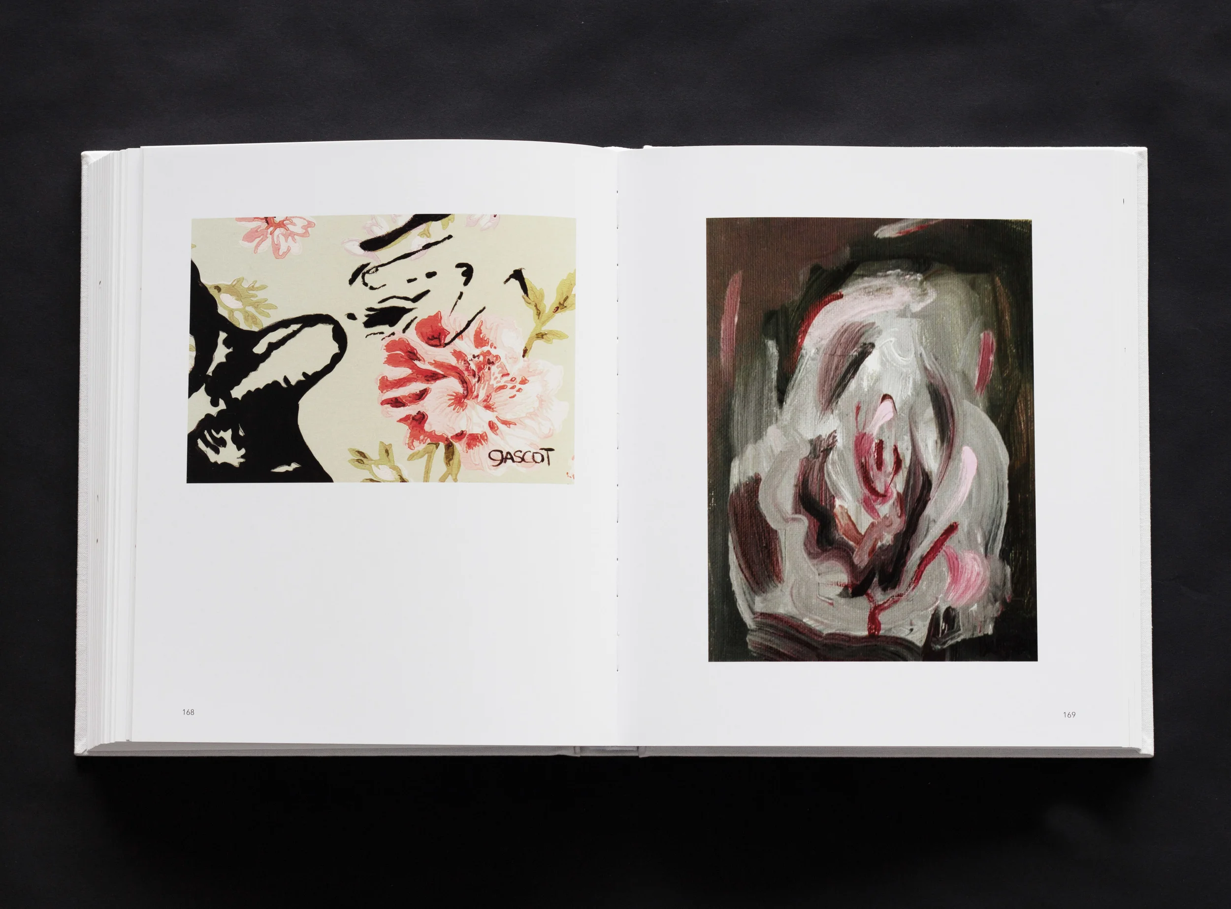
A bit of ‘gay vagina anthropology’. Asking gay men to draw vaginas – or vulvas to be correct – might sound to some people like opposites. But it’s this combination that makes Gay Men Draw Vaginas so intriguing. What the men drew, whether ‘accurate’, or ridiculous or abstract, it was up to them. And as much as this publication is there for a quick laugh at the coffee table, it can also be part of a larger social discourse on gender, sex, identity and the body. In the end, it’s really a question of how the viewer intends to look at the book.

Ultimately, though, we hope people do a lot of things; we hope they’ll laugh, we hope they’ll think about what it means to identify as a “gay man”, we hope they’ll think about ideas our culture has about bodies and body parts.

Keith Wilson and Shannon O’Malley are the curators of Gay Men Draw Vaginas. A couple of years ago, Keith and Shannon had dinner with friends, which turned into a conversation about vaginas. Given the boys’ lack of vagina knowledge, Shannon asked Keith to draw one, and so he did. It was bad. Then his boyfriend drew one, which turned out prettier, albeit much more inaccurate. Everyone at the table became fascinated with these drawings – that evening the project was born, and the two started collecting as many interpretations of the term vagina from anyone who identified as a gay man. The results range from fine art to simple crayon drawings; and from misogynist to a mix of abstract, bizarre, funny, clever, puzzling and beautiful vaginas.

Photographed by Ali Baïlon for GOODS WE LIKE.

YIELD - Outdoor Spun Planter

Alex Rückheim

YIELD - Outdoor Spun Planter

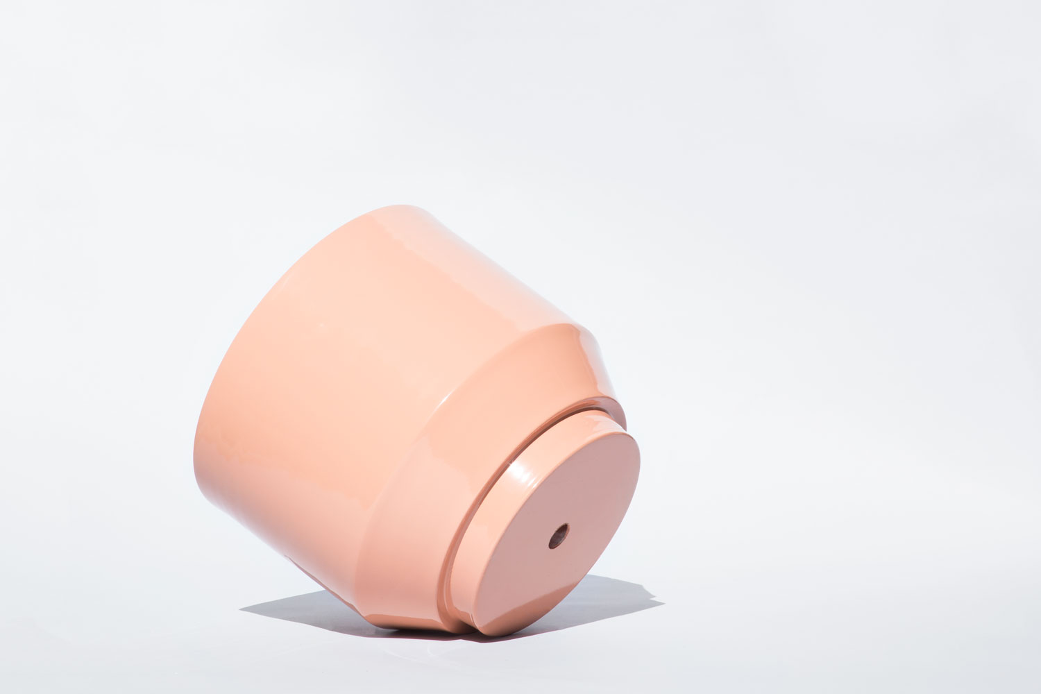
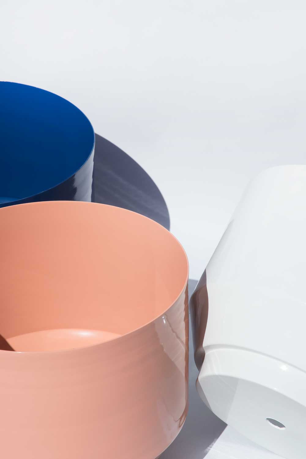
YIELD’s new extra large outdoor spun planter is made from a single piece of powder-coated metal. At 16" in diameter, the planter holds a range of both large plants and smaller trees.

Founded in 2012 by Andrew Deming and Rachel Gant, YIELD is part studio, part label and part manufacturer. The independent design studio creates objects mainly for the home blending American craft with forward-thinking ingenuity.

MULLER VAN SEVEREN – Coasters

Alex Rückheim

MULLER VAN SEVEREN - Coasters

With both Fien Muller and Hannes Van Severen being artists, their collections sit somewhere between design and art. “It’s obviously ‘furniture’ but the emphasis is not completely concentrated on function and suggests different ways of living and use of space… an uncanny twist on universal forms.” 

Muller Van Severen’s notion of colour and colour combinations is not less intriguing. Sometimes subtle, sometimes contrastingly bold, but always with a harmonious result. Such as the Coasters that are both wall sculptures and functional objects.

JEONGHWA SEO - Basalt Stationery Series

Alex Rückheim

JEONGHWA SEO - Basalt Stationery Series

The Seoul based designer, Jeonghwa Seo, created a range of stationery pieces each carved from natural stones in Jeju, the largest island in South Korea. The collection comprises a paper weight, coasters, a bookend, a pen holder, a pen tray and a business card tray. The items nicely mimic and reflect their surrounding: the island’s coastal rock formations, the 386 volvanic peaks as well as the typical pathways and gate posts found across the island. 

The range was developed as part of a design project supported by the Korea Craft and Design Foundation, a public institution founded to establish the identity of Korean creative arts.

Photographed by Unreal Studio.

SABINE MARCELIS - Voie Light Series

Alex Rückheim

SABINE MARCELIS - Voie Light Series

Light. Neon. Circles – the ‘Voie’ series by Dutch lighting and product designer Sabine Marcelis is a collection of lighting born out of the curiosity to manipulate the path of light. Playing with resin allowed her to manipulate the line of light in different ways, creating a stronger diffusion or dimming effect, she explains.

‘My pieces are functionally decorative in the end and demand an interaction with the space and user.’

The trained industrial designer has artfully carved her own niche. Her objects are functionally decorative and demand an interaction with both the space and user.